“When art critics get together they talk about Form and Structure and Meaning. When artists get together they talk about where you can buy cheap turpentine.”
~ Picasso (Alex: there’s a trading parallel in here somewhere….)
Good morning!
In this week’s Dirty Dozen [CHART PACK] we take a look at ACWI breadth and trend data, go through the inflation dashboard, cover real rates, CAPEX anemia, and much more…
Let’s dive in.
***click charts to enlarge***
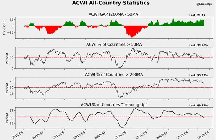
- The ACWI All-Country stats: Prices are extended from their 200dma, only 43% of index members (countries) are trading above their 50dma, and for the first time since September of last year, less than half of countries are in an uptrend.
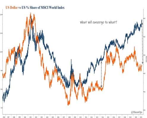
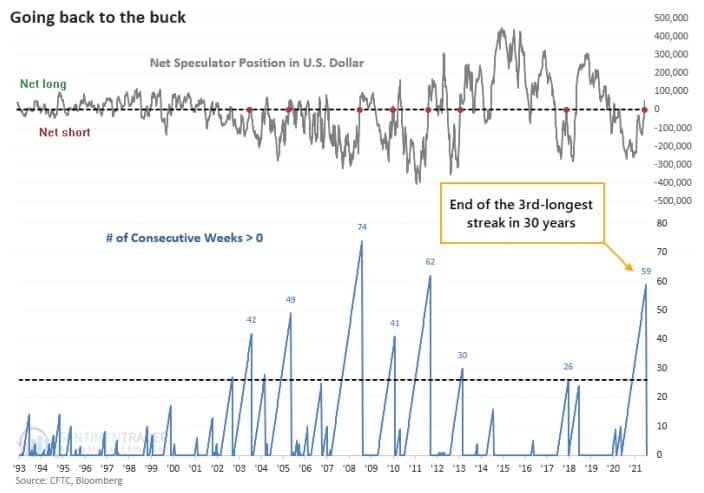
- Shared this one in a note to Collective members yesterday. There’s a lot of critical data points converging in the US dollar right now suggesting a major inflection point is near (historical price compression, flip in positioning, wide divergence in US vs MSCI World Index).
Keep your eyes on this one…

- SentimenTrader points out that DXY just saw an end to its 3rd-longest streak of net short positioning in as many decades. This has historically been a positive signal for USD.
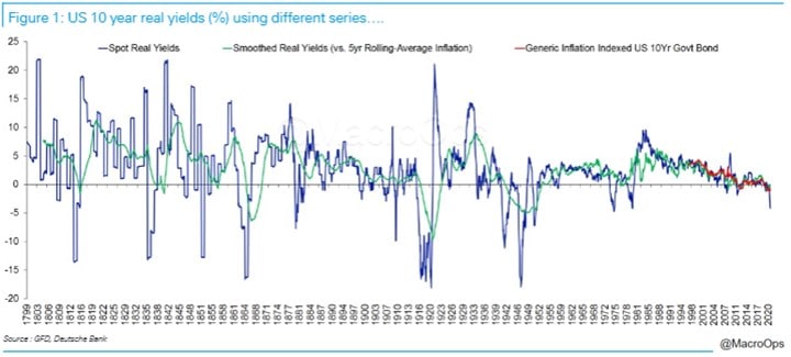
- Chart and accompanying text via DB’s Jim Reid:
I’ve been on record over the last few years for saying that with debt so high real yields are likely to stay negative for the rest of my career as the authorities have to control funding this rising leverage. I’m even more convinced of this post pandemic. I hope if I’m wrong I can apologize and still have a career though.
Anyway, positive US real yields for any length of time would likely set off debt crises around the world so we are probably stuck with the regime. However, you can still have negative real yields and higher nominal yields. Most of the big debt reductions seen through history have seen such a wide gap via higher inflation. In some ways, we are seeing that now.
- Speaking of real yields Bloomberg’s CPI dashboard shows inflationary pressures continue to mount.

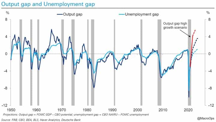
6. Plus, we’re about to see both the output and employment gaps close, via DB:
By Q1 2022, US output and employment gap likely fully closed. Pretty much the quickest gap closure for both at this stage of cycle in history… Six plus years ahead of post-GFC recovery
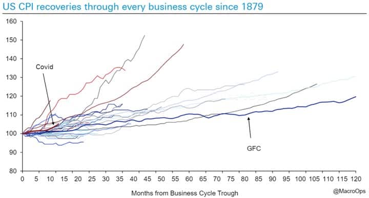
- CPI is recovering at its 7th fastest pace following every recession going back to 1879 (via DB).
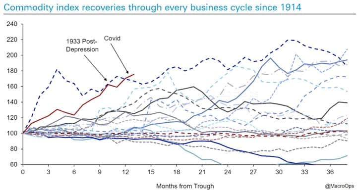
- And commodities are seeing their strongest recovery in over a century… (chart via DB).
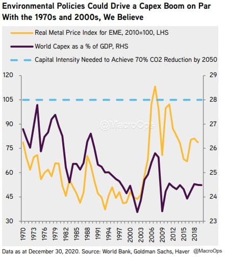
- If you’re wondering why this is, the following three charts give the reason. World CAPEX as a % of GDP has been anemic for the last decade (chart via KKR).
- Copper CAPEX is back to levels it last saw in 2002 (chart via KKR).

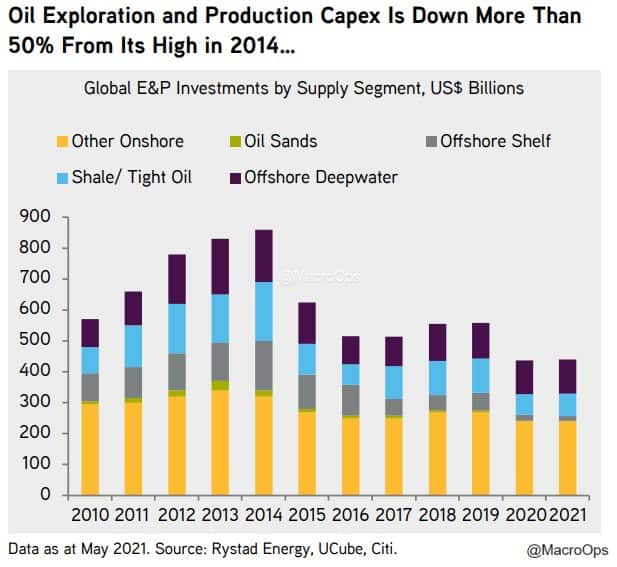
- And oil exploration/production CAPEX has more than halved from this 2014 highs… These trends are unsustainable for a host of reasons. The Capital Cycle will be a dominant driver of markets over the coming decade(s).
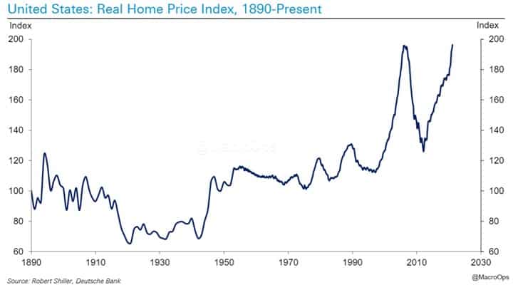
- We’ve been bullish the housing cycle for the last couple of years and continue to be so, at least out to 2024/25’ due to reasons of demographics and supply. But, longer-term, this is not sustainable… (chart via DB)
If you enjoy reading these Dirty Dozens each week then please feel free to share them on the Twitters, forward them to a friend, or translate them via smoke signal, etc… Every bit helps us get our name out there.
Thanks for reading.
Stay safe out there and keep your head on a swivel.