Spreadsheets make everything look linear and controlled, but the real world oscillates, overshoots, collapses, and rebounds. A company with operational and financial flexibility—what we mean by staying power—is able to exercise options that are quite valuable at different points in the cycle. Without the firm handle on that flexibility that credit analysis provides, we’d argue you can’t fully understand the wealth-creation process as an equity investor. ~ Mitchell Julis
Good morning!
In this week’s Dirty Dozen [CHART PACK] we check out the technical setup in bitcoin, look at the year-to-date performance in precious metals, contrast that with the worst rolling returns in commodities since the Great Depression, muse on what could kill the current dominant trends and thus cause the most pain, and end with a long shipping trade, plus more…
Let’s dive in.
***click charts to enlarge***
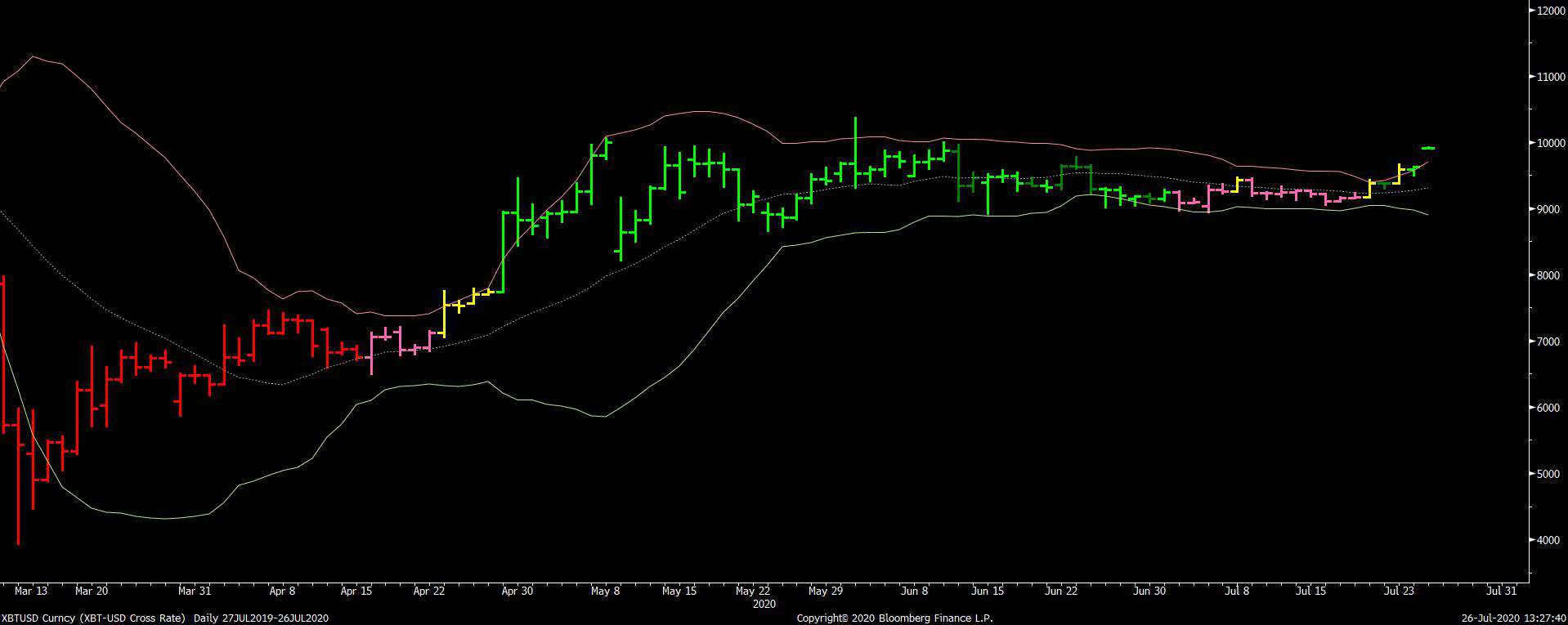
- Bitcoin (BTCUSD) just broke out of one of its tightest coils in a long while. Compression regimes such as these tend to lead to powerful expansionary ones (big trends). There’s a host of fundamental reasons to like the play right now, as well. The second round of $1,200 stimulus checks to fund retail speculation is one of them. Now is a good time to load the boat if you don’t already have a position on…
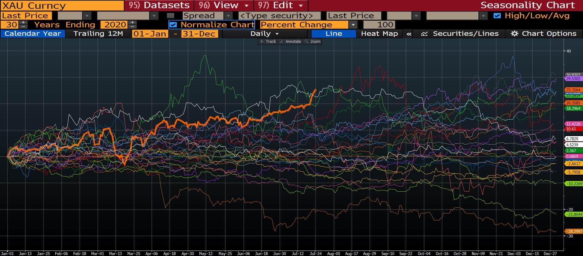
- Gold has put in its best year-to-date returns in 30-years (orange line). While we’re sure to see a shakeout at some point, the macro fundamentals very much support this trend and it’s ultimately going to go much higher (see my framework for analyzing precious metals here).
- The bull market in gold is coinciding with the worst 10-year rolling returns from commodities since the 1930s. It’s anybody’s guess when this deflationary regime will end, exactly. But the trends that will be born out of the next regime reversal will be incredible.

- In a similar vein, BofA points out that the “All-weather” portfolio (25% stocks, 25% bonds, 25% cash, 25% gold) has just seen its best 90-day returns in history. We are likely at the “As Good As It Gets” point with this asset mix. Which begs the question, where is the pain trade here?

- Are we seeing the “permanent death of value” as some are now starting to proclaim? Or, are we near the zenith of its sagging relative performance to growth?
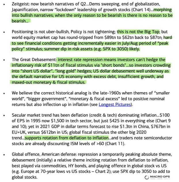
- BofA did a good job of spelling out the current zeitgeist and the reasoning behind some of the big moves we’re seeing (highlights by me).
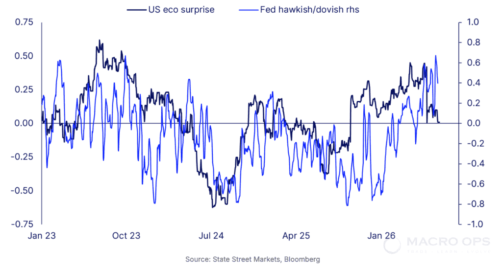
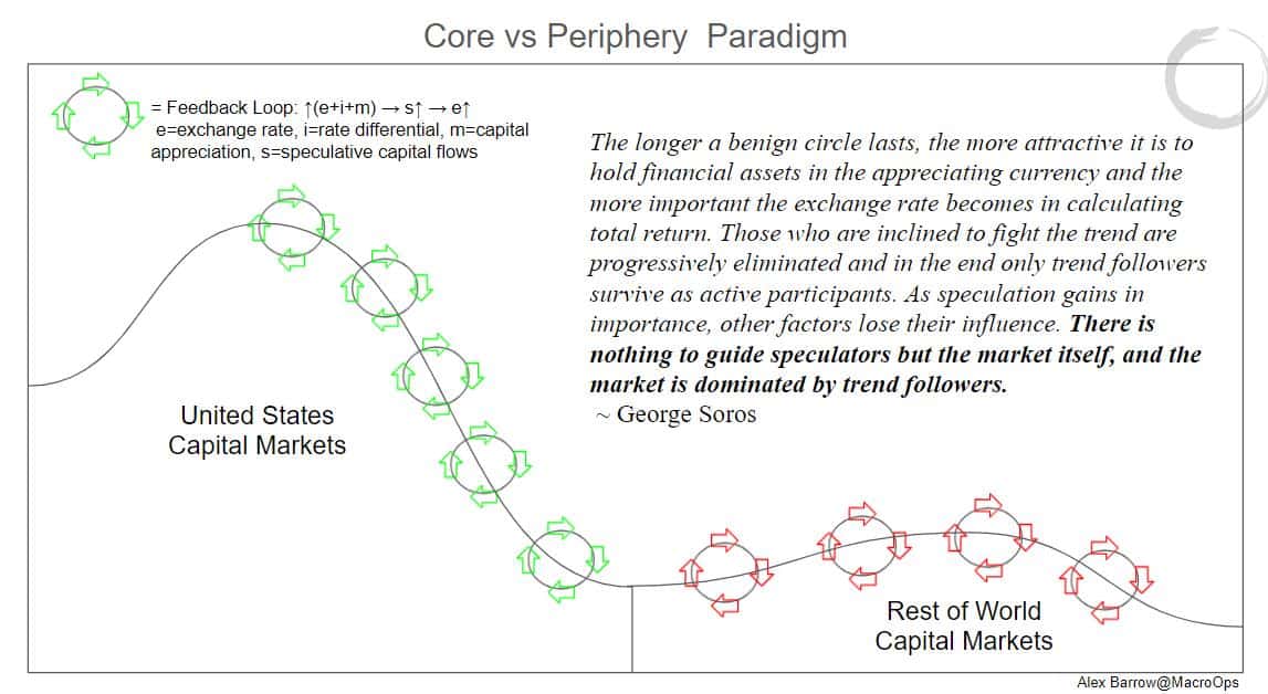
- If you look at markets around the world and start putting all the pieces together, an interesting picture begins to form. This picture suggests we’re getting closer to a reversal of the feedback loops that have supported this deflationary (Core Domination) thematic and soon the feedback loops will begin to support the Periphery over the Core (inflationary assets over deflationary). Graph is from a report I’m working on.
- Yields are the fulcrum of the global financial system. Falling yields have been a large reason behind our continued bullishness these last three months at MO; fat risk premium, TINA, and all that…
Well, the MOVE Index, which is a measure of US rate volatility implied by 1-month OTC options on Treasuries just hit an all-time low. Harley Bassman, the creator of the index, says this of it (emphasis by me):
“One can think of the MOVE as ‘the VIX for Bonds… By its design, MOVE has the unique ability to provide a signal for changing risk sentiment in the fixed income markets. While I would not call it predictive in isolation, rare is the case where a simultaneously low MOVE, flat Yield Curve, and tight Corporate Spreads are not soon followed by bothersome market conditions.”
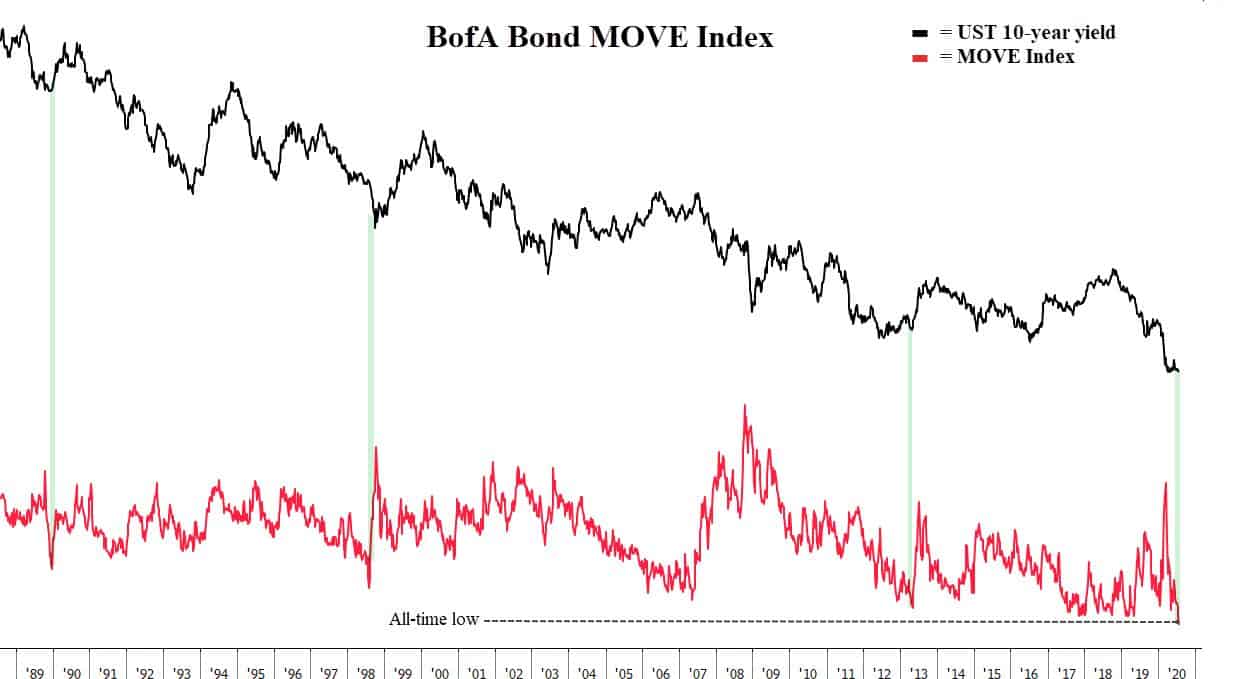
- Compression precedes expansion in markets. It’s no different in bonds (yields).
I’m always on the lookout for the pain trade. And if there’s one thing the market could do to piss in the herd’s cheerios right now, it would be a spike in yields. You wouldn’t even need a large jump, just a 75bps move in the 10yr would be enough to kill the growth and All-Weather trade and explode volatility across all assets.
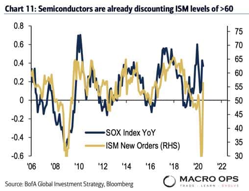
And on that note, here’s an interesting chart from BofA. It shows the semiconductor index (SOX), a bellwether for growth, is currently discounting ISM levels over 60. ISM has a strong correlation — often a leading one — to yields (higher ISM = higher yields). If the ISM were to rise above 60 we’d likely see yields rise a good amount too.
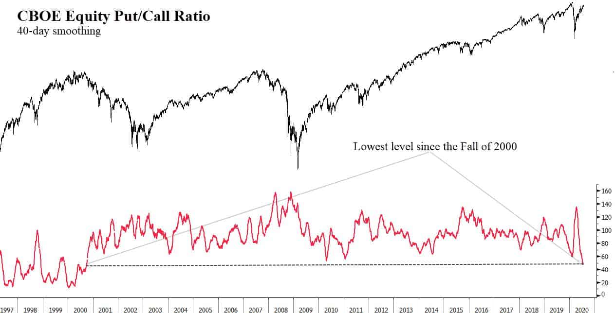
- If this were to occur it would be during the most complacent positioning in the options market in 20-years.
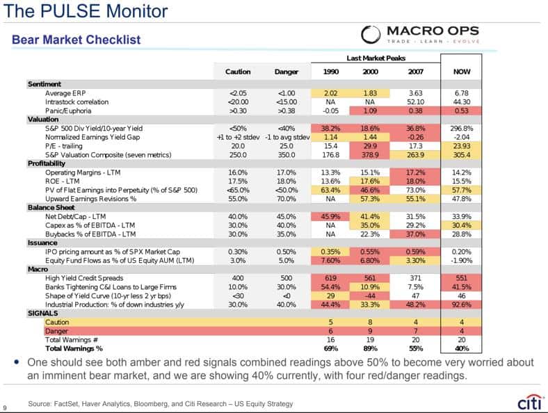
- Meanwhile, Citi’s Pulse Monitor Bear Market Checklist shows that the risk of an extended bear market is increasing. An “imminent bear market” signal is triggered when amber and red combined readings rise over 50% — current readings are 40% with four “danger” signals. Total warnings were just 25% when I shared this table last month.
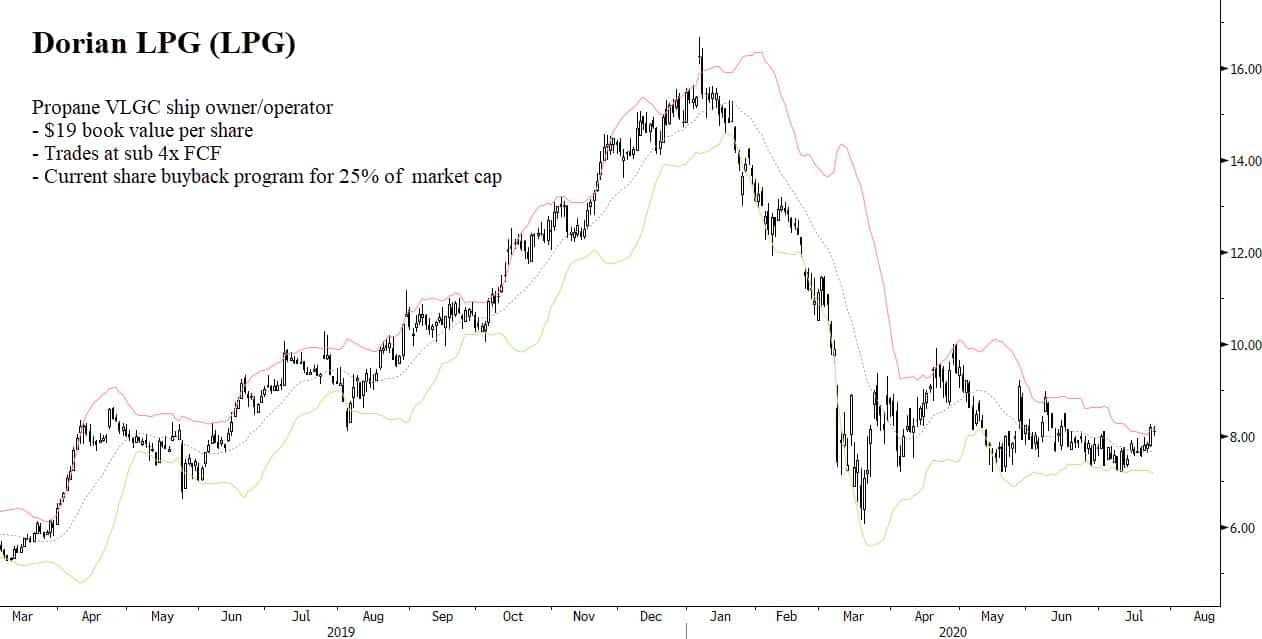
- Dorian LPG (LPG), a propane VLGC owner/operator, is breaking out of a tight coiling wedge bottom. The virus did some temporary damage to the bullish shipping thematic but with a non-existing order book and practically no willing parties to finance new builds, it’s a matter of time before the Capital Cycle drives shipping stocks much higher.
LPG trades on the cheap, has a strong balance sheet, good management, and is buying back a large percentage of its market cap. The current technical setup gives a good risk-reward entry.
Stay safe out there and keep your head on a swivel.