Grave dancing is an art that has many potential benefits. But one must be careful while prancing around not to fall into the open pit and join the cadaver. There is often a thin line between the dancer and the danced upon. ~ Sam Zell
Good morning!
In this week’s Dirty Dozen [CHART PACK] we look at signs of slowing growth here in the US along with data pointing to a rebound elsewhere. Plus, we take a look at where the money is flowing, check-in on sentiment, discuss a potential major bottom in a LatAm country, see what’s going on in Japan and point out the massive compression regime in major FX pairs, and more…
- The Atlanta Fed’s GDP Now Forecast is pointing to a big dip in 4th quarter GDP. This is a noisy indicator but my other indicators are saying the same. US growth is slowing…
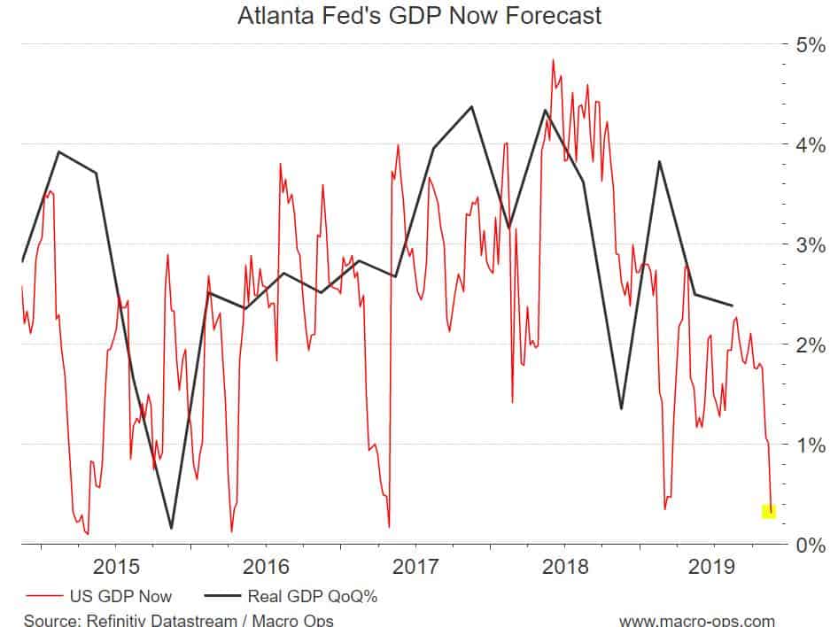
- That’s okay though, we’ve been expecting lower GDP growth and believe it should bottom in the 4th quarter before turning up slightly. When you hear the bears wailing about the lower prints just remember this from Druckenmiller, “The best environment for stocks is a very dull, slow economy that the Federal Reserve is trying to get going.”
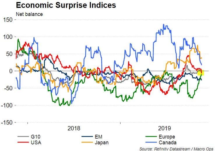
- Citi’s Economic Surprise Index (CESI) just turned negative for the US. This should help keep yields in the US from rising too much. Which, of course, is supportive of equities. The only two large countries seeing positive surprises at the moment are Canada and Japan — more on one of these in a moment.
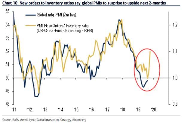
- This chart from BofAML showing PMI New Orders / Inventory Ratio for the US, China, Europe, and Japan suggests we’re about to see the global manufacturing PMI turn up in a big way.
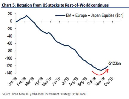
- The new smells of “risk-on” in the air are driving fund managers to divert more and more of their funds from crowded and expensive US stocks into its much cheaper counterparts (chart via BofaML).
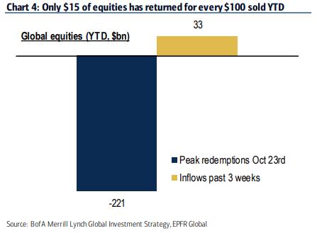
- And there’s LOTS of fuel for a run higher in stocks. BofAML notes in a recent report that “for every $100 of redemptions from equity funds YTD, $15 of buying in past 3 weeks”.
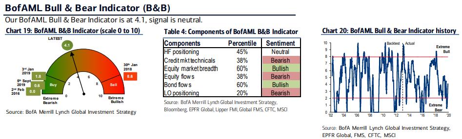
- Despite this rally to new all-time highs in the major indices, the bullish sentiment isn’t as bullish as one might think. BofAML’s Bull & Bear Indicator is in buy territory showing a modicum of bearishness present in the market still.
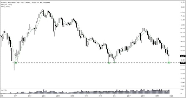
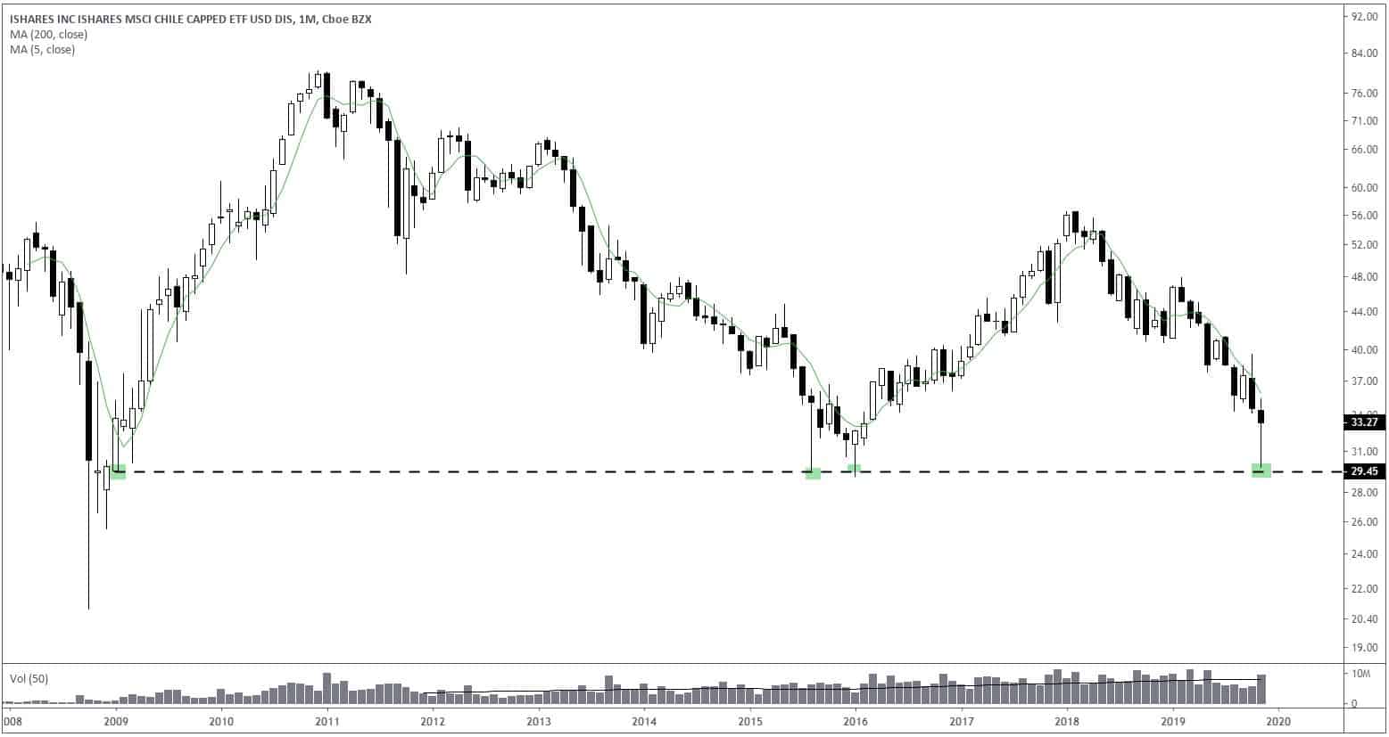
- Below is a chart of the MSCI Chile country ETF (ECH). Chilean stocks have been punished over concerns regarding violent protests in the country and what it may mean for the country’s politics going forward. This monthly chart below of ECH shows that the ETF sold off down to its decade-long support line, one that it’s tested three other times in the past, before reversing back up. We’ll have to see if it can hold onto its gains going into month’s end.
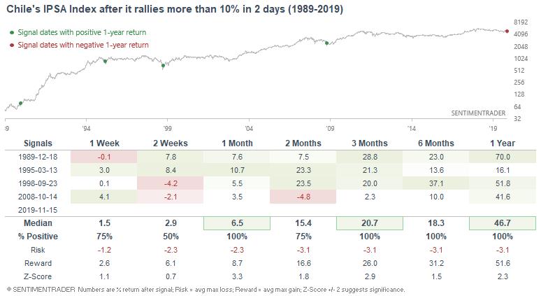
- This table from Sentiment Trader shows the few other times that Chile’s IPSA Index has rallied more than 10% in 2 days. They point out that “such strong rallies are rare, with the last 3 signals occurring near multi-year bottoms.” Keep an eye on this one…
- Back in early September, I pointed out the bullish technical setup in the Japanese Nikkei and also noted a number of the fundamental tailwinds the country is currently benefiting from (link here). The Nikkei has since broken out, advancing close to 15% over the last two months. There are a number of reasons of why Japanese stocks are doing so well, one of these is simple: earnings are surprising to the upside after a long stretch of negative disappointments (chart via MS).

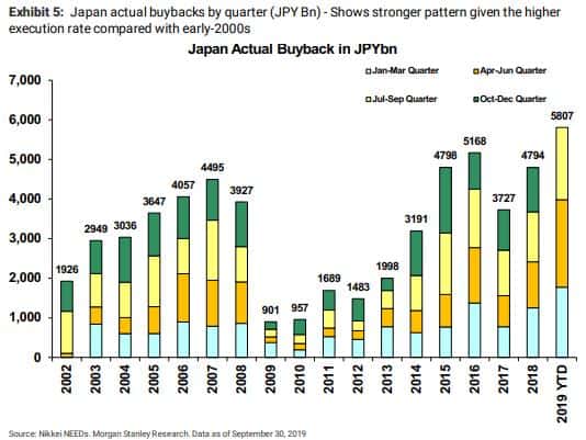
- And even more importantly, buybacks in Japan are breaking records this year. Seems like all the work of US activist fund managers cajoling Japanese boards to be more shareholder-friendly is starting to pay off (chart via MS).
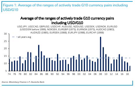
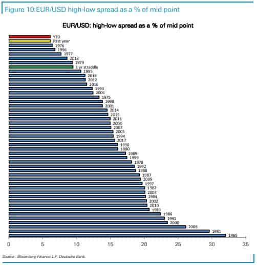
- This one is a twofer. Back at the beginning of this year the MO team and I began harping on the incredibly compressed volatility regimes we were seeing across the major macro instruments (precious metals, bonds, FX majors). Here’s a link to one of our pieces on the subject “There’s a BIG Macro Move Brewing in Markets”. We’ve since seen precious metals (gold and silver) break out and move into a vol expansion regime, and then bonds soon followed suit.
Now we’re just waiting on the very last shoe to drop: FX. And in particular, the major DXY pairs. These two charts from DB show volatility for the major G10 pairs is at its most compressed EVER… EURUSD is about to put in back-to-back years of its lowest vol in history… Markets are like rubber bands. Compression regimes, like the one we’re currently in, mean there’s a lot of stored up energy (the rubber band has been twisted tight). Well, this band is about to snap. Stay on your toes…