It may be readily conceived that if men passionately bent upon physical gratifications desire greatly, they are also easily discouraged; as their ultimate object is to enjoy, the means to reach that object must be prompt and easy or the trouble of acquiring the gratification would be greater than the gratification itself. Their prevailing frame of mind, then, is at once ardent and relaxed, violent and enervated. Death is often less dreaded by them than perseverance in continuous efforts to one goal.
~ Alexis de Tocqueville
Good morning!
In this week’s Dirty Dozen [CHART PACK] we look at the widening gap between the positive hard data and the horrendous soft data, we check in on global central bankers to see what they’re up to, take a look at earnings season and where the beats and misses are trending and more…
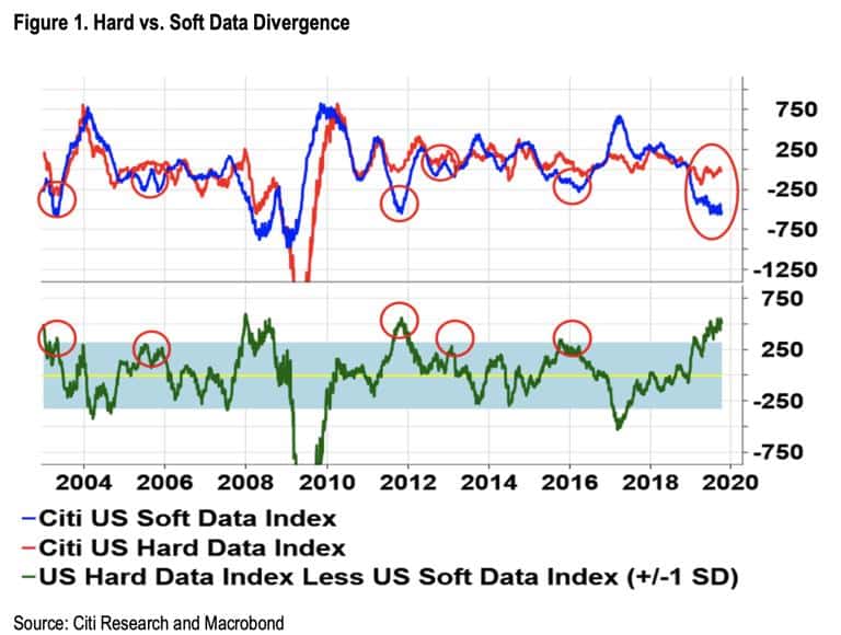
- There’s been a lot of talk about the growing divergence between hard and soft (survey) data over the past few months. Here’s a great chart from Citi showing just how unusual the current gap between the two is. The red circles highlight the fact that when the two diverge it’s usually the soft data the reverts back to the hard economic numbers. The one time this didn’t happen though was in 2008 so… feel free to go ahead and use this chart to confirm your priors.
- A benefit of the declining global economic picture, for risk assets at least, is that it has central bankers around the world hitting the gas pedal again. The percent of central banks cutting rates hit its highest level since the GFC this month (chart via FT).
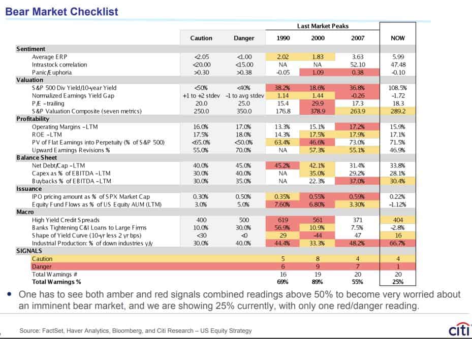
- Citi’s Bear Market Checklist is still giving the all-clear. Current warnings only add up to 25%. For an official bear market signal, we need to see amber and red warnings add up to over 50%.
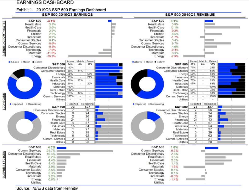
- I think this quarter’s earnings will be the big tell on where things are headed in the intermediate-term. And we have a busy week on that front, with a number of highly followed companies reporting over the next five days (chart via Earnings Whispers).
- So far, companies have had an easy time hurdling the low bar (pessimistic earnings consensus) with 84% of S&P 500s companies that have reported so far, surprising on the upside.
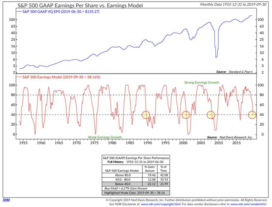
- That’s not to say the longer-term earnings picture is all hunky-dory. NDR’s SPX Earnings Model, which breaks earnings into two main categories (1) strong earnings growth and (2) weak earnings growth, shows that the trend has just moved into the “Weak Earnings Zone”. There’s been a number of instances where the model has crossed into these levels only to rebound later but something to keep in mind (chart via NDR & CMG Wealth).
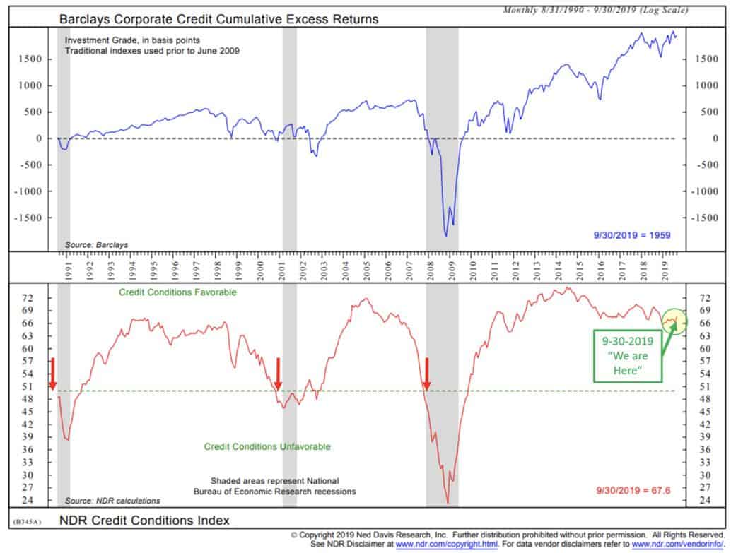
- One thing that I think isn’t properly appreciated by the bears is just how much buybacks are driving this bull market. Net share destruction (share issuance – buybacks) has been significant. Companies buying back their stock has been pretty much the only demand source propping up this market year-to-date as investors have been net sellers for the most part. It’s difficult for me to see how this trend doesn’t continue as long as the credit market stays willing to fund it, which they appear to be at the moment (chart via NDR and CMG Wealth).
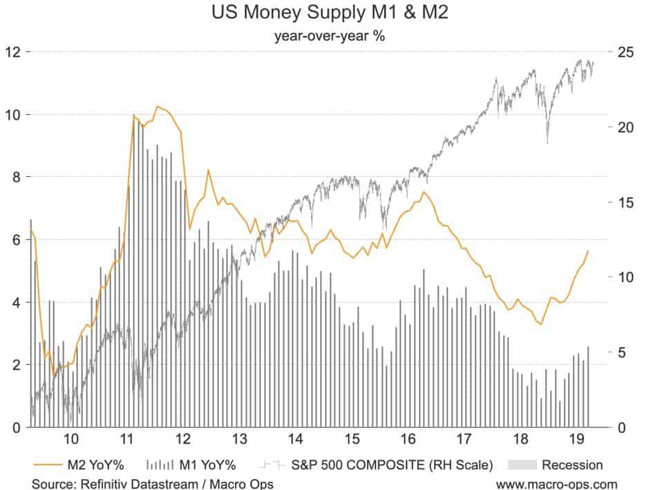
- The money supply in the US (both M1 and M2) has been picking up since the beginning of the year.
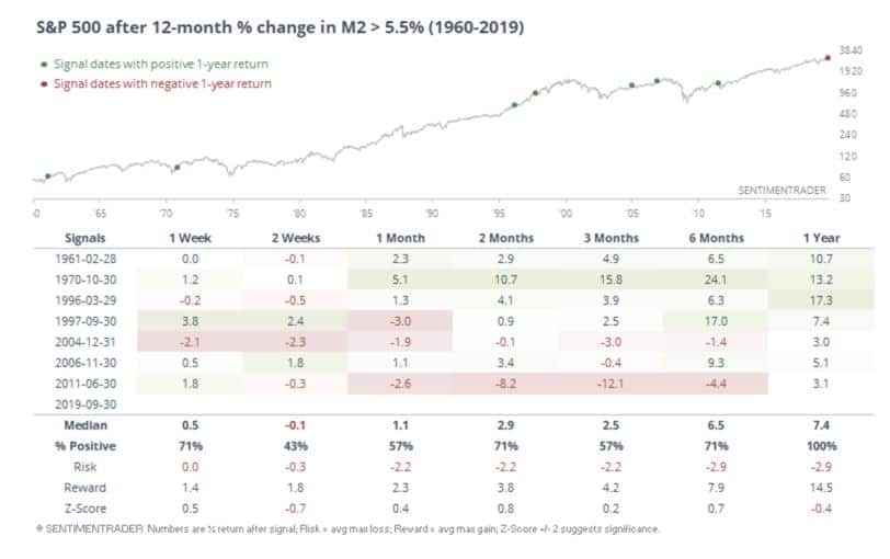
- This graph from Sentiment Trader shows that when the 12m growth in M2 is greater than 5.5%, as it is now. It tends to be positive for stock market returns going forward.
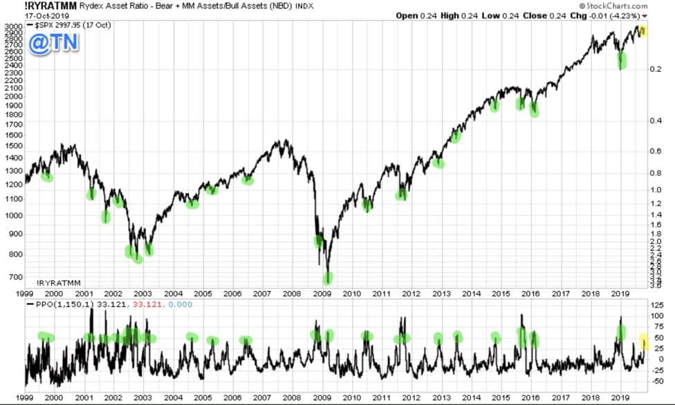
- @TN shared this great chart last week showing the Rydex Bull-Bear Asset Spread. When this ratio spikes, like it is now, it means that investors are positioning defensively. The highlighted points note that this is almost always a bullish sign going forward for the market.
- This graph from Koyfin (the best free charting and market analysis tool out there) shows country ETF performance over the last month. I like to regularly check up on this gauge of short-term momentum to see where the money is flowing. It looks to me like capital is starting to make its way back to the undesirables (the unloved and underweighted). Europe and Lat-Am, and even parts of Asia are worth a look. If the dollar breaks here then these will take off like a banshee.
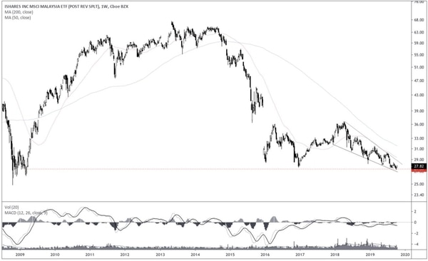
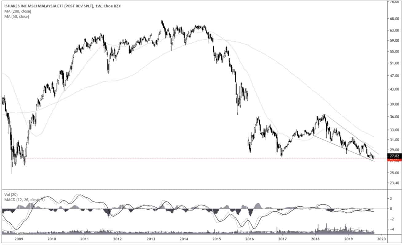
- Malaysia (EWM) is one of these charts worth watching. It’s nearing 10-year lows and has been trading lower in a tight coiling descending wedge pattern. Patterns like this often precede explosive moves higher. Plus, I hear the country is readying major tax cuts and fiscal stimulus is on the way.

