When any causes beget a particular inclination or passion, at a certain time and among a certain people, though many individuals may escape the contagion, and be ruled by passions peculiar to themselves; yet the multitude will certainly be seized by the common affection, and be governed by it in all their actions. ~ David Hume
Good morning!
In this week’s Dirty Dozen [CHART PACK] we take stock of the technical damage done to the market, look at the historical signs of panic selling and capitulation, before jumping over to China’s latest economic numbers, and analyzing copper’s technical setup, plus more. Let’s dive in…
SUBSCRIBE TO THE MONDAY DIRTY DOZEN HERE
***click charts to enlarge***
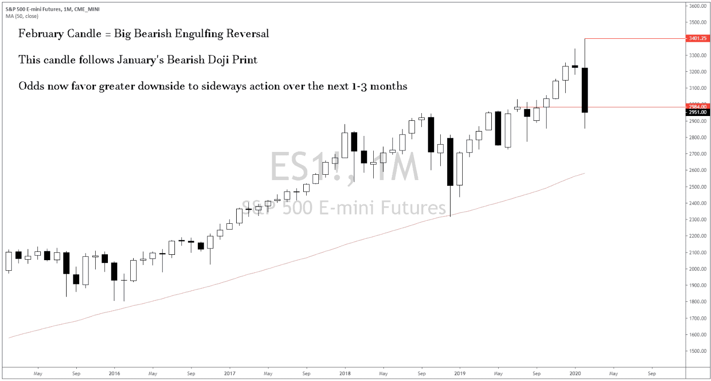
- It’s a new month and with a new month, we get new monthly bars! And dear Zeus… was a LOT of technical damage done to many-a charts last week. February formed a bearish engulfing reversal candle on the SPX. This means it’s odds we see 1-3 months of sideways to downwards action. Expect a ton of chop; face-ripping rallies tempting you to believe the bottom is in, followed by gut-wrenching sell-offs. Welcome to the new Bull Volatile regime.
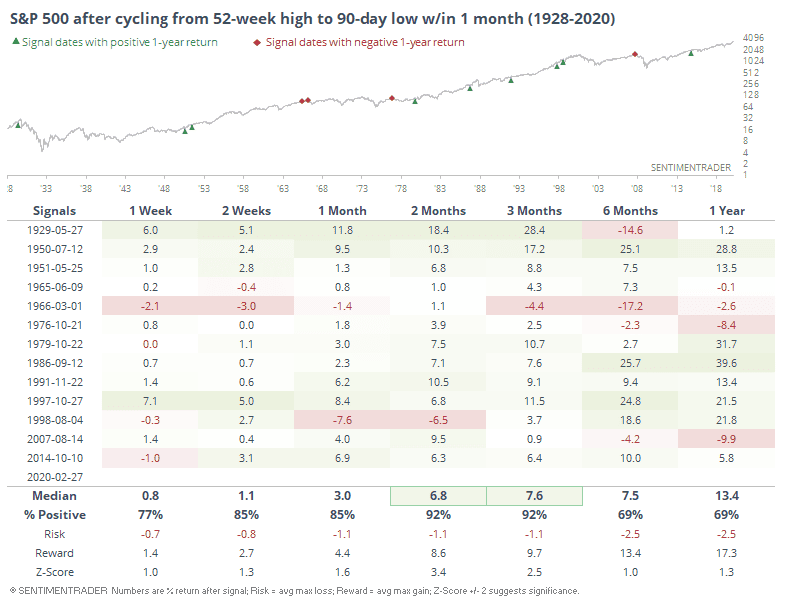
- SentimenTrader noted in a post “how this is one of the fastest times the S&P has ever cycled from a new high to at least a 4-month low… Of the 14 times, the S&P has erased so many late buyers’ gains so quickly, they stepped back in 13 times. The 1998 signal suffered some large losses over the next month, but those were subsequently made up over the next couple of months. Several of these ended up morphing into bear markets, but not until 6-12 months later.”
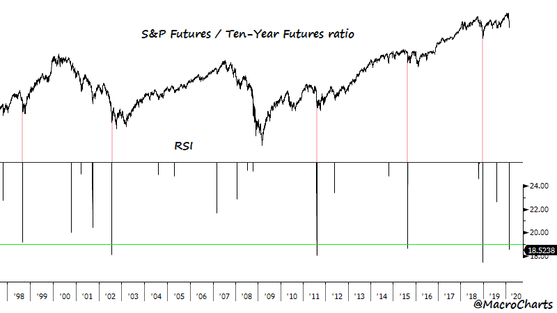
- @MacroCharts published a post pointing out the extreme oversold conditions we found ourselves in late last week, showing the Stock/Bond ratio as an example. He wrote “The Stock/Bond ratio hit an 18 RSI in the overnight session. This is an extremely powerful and historic signal.”
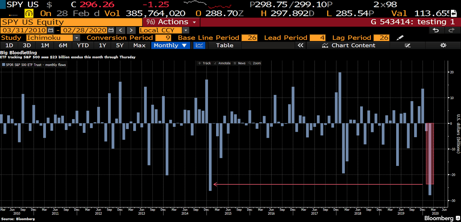
- Panic selling led to the largest monthly outflow from the SPY ETF in history. A record $27bn in cash was pulled from the ETF…
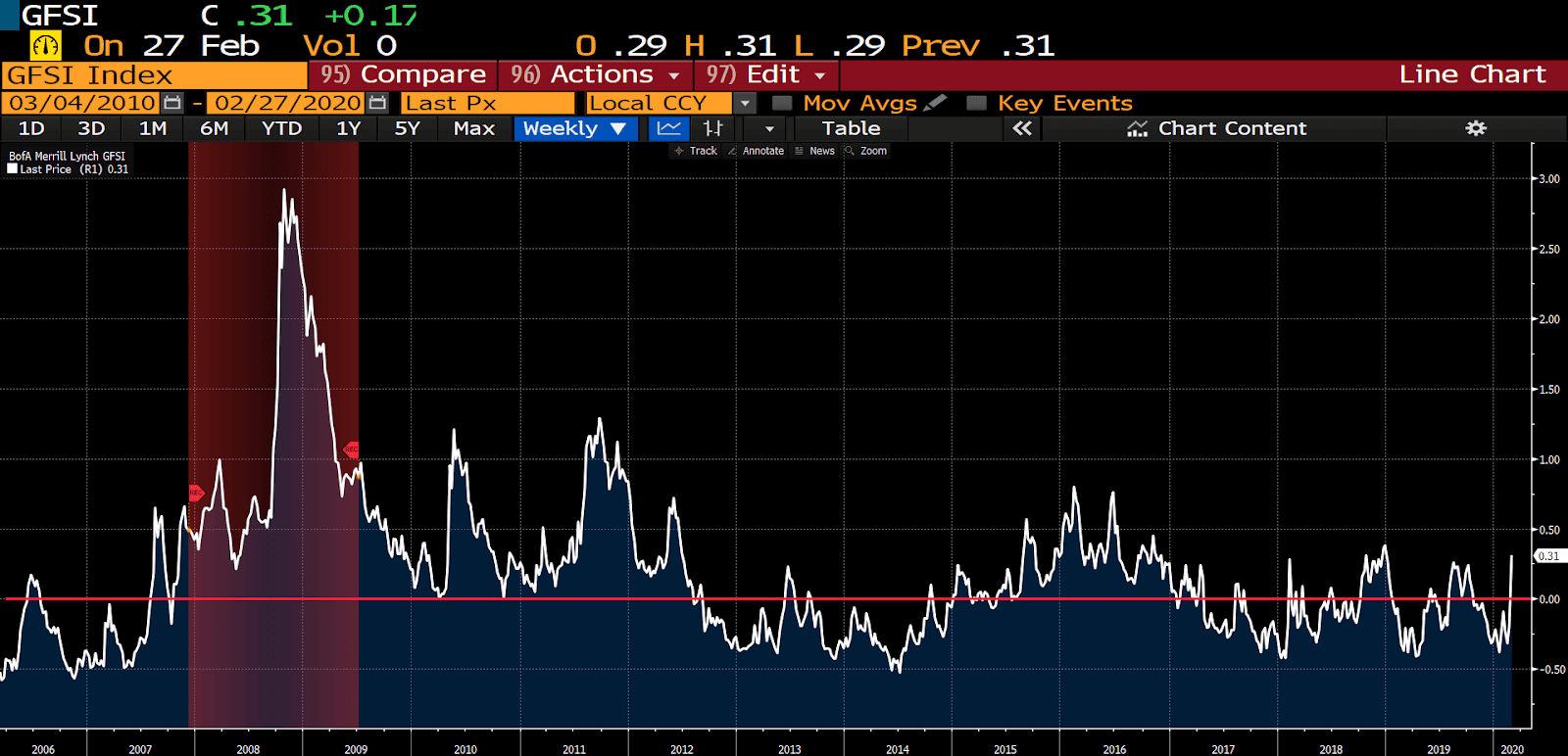
- Bank of America’s Global Financial Stress Index, an indicator which is comprised of 23 measures of financial risk, shot up to its highest level in over a year. If this index stays elevated it will mean bad news for equities going forward.
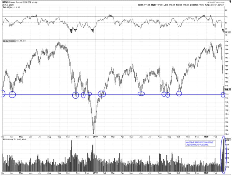
- Jesse Stine sent out a note over the weekend — his letters are always worth a read, here’s the link. One of the many charts he shares is this one of the small caps index (IWC). Jesse writes “This is the MACK-DADDY line in the sand that I’m watching. Small caps are now lower than they were 2 years ago. This chart leads me to believe that we may rebound immediately and may NOT see a 2nd down week.”
- SentimenTrader’s Smart/Dumb Money Confidence spread is reverting from extreme levels of complacency.

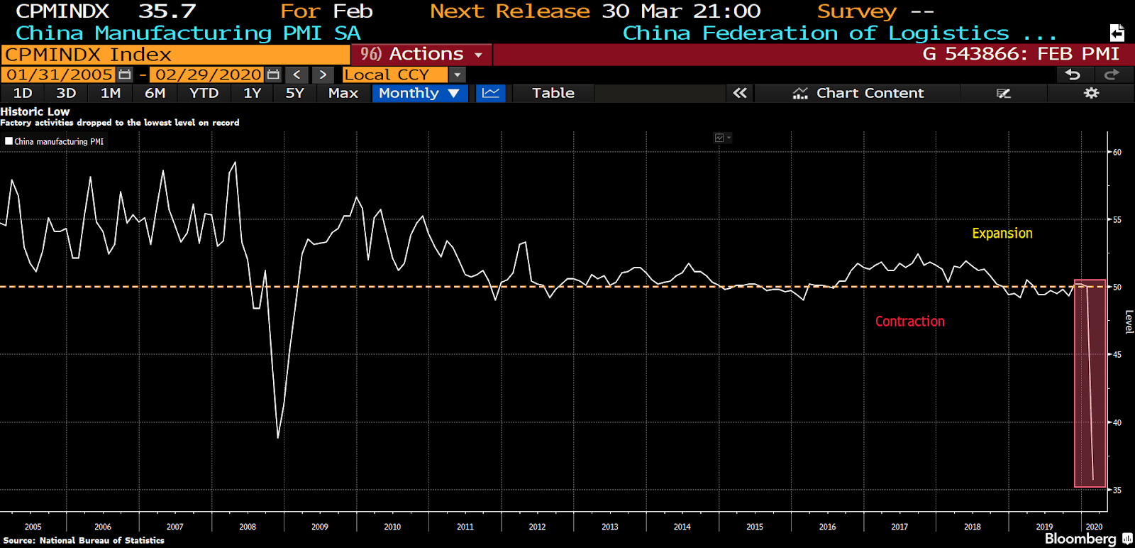
- China’s manufacturing sector contracted sharply last month, plunging to 35.7, its lowest level ever. Bloomberg writes that the poor print was “largely due to virus control measures that have made it hard for workers to travel back after the Lunar New Year, and left factories owners with limited raw materials to restart production.”
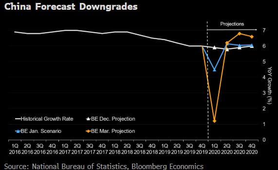
- Bloomberg Economic’s team downgraded its China’s GDP forecast over the weekend. Their base case is now calling for China’s 1Q GDP growth to fall to 1.2%. It’s slowest growth on record and 3% below their previous estimates.
- A fellow Collective member who’s based out of Shanghai wrote in our internal chatroom last week that traffic there had mostly returned to normal after the city had been at a crawl just a week prior. I’ve seen a slight tick up in the traffic and pollution data, but not enough to suggest things are back in full-swing though that could quickly change once the latest data is released.

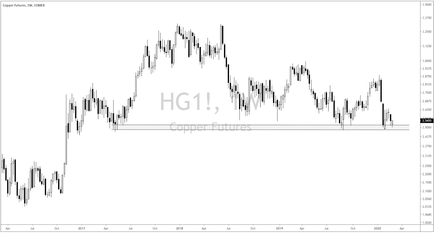
- Copper (HG_F) is still my favorite market to watch for a tell when we’ll get a risk-on bounce. As of right now, the charts look good. The weekly chart is at long-term support and it looks like it wants to put in a complex double bottom off its lower Bollinger Band on the daily.

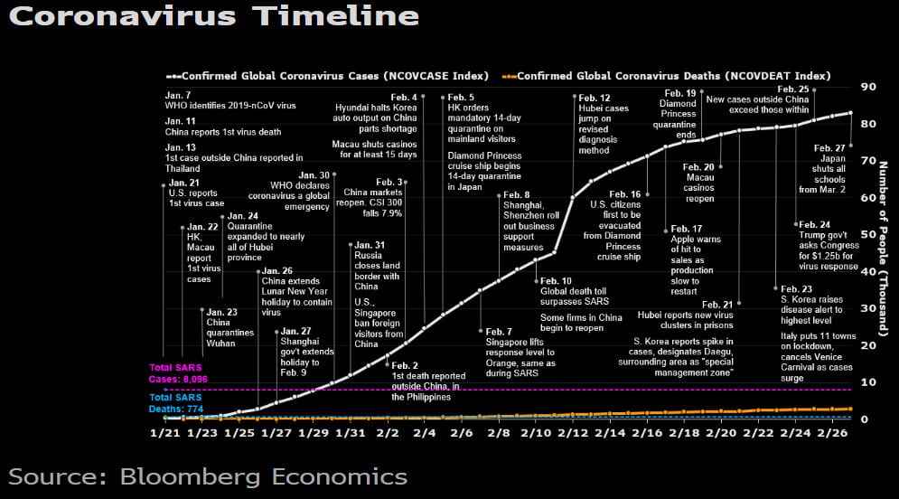
- And finally, here’s a great coronavirus timeline chart from Bloomberg.