Welcome to Episode 42 of Vol Street Journal™!
I’ve been on the road since Thursday so there’s no video for this week’s “episode”. Instead, I’ve gone back to my Substack roots with a written synopsis of what I’m seeing in the volatility market and beyond. Here we go!
Market Models
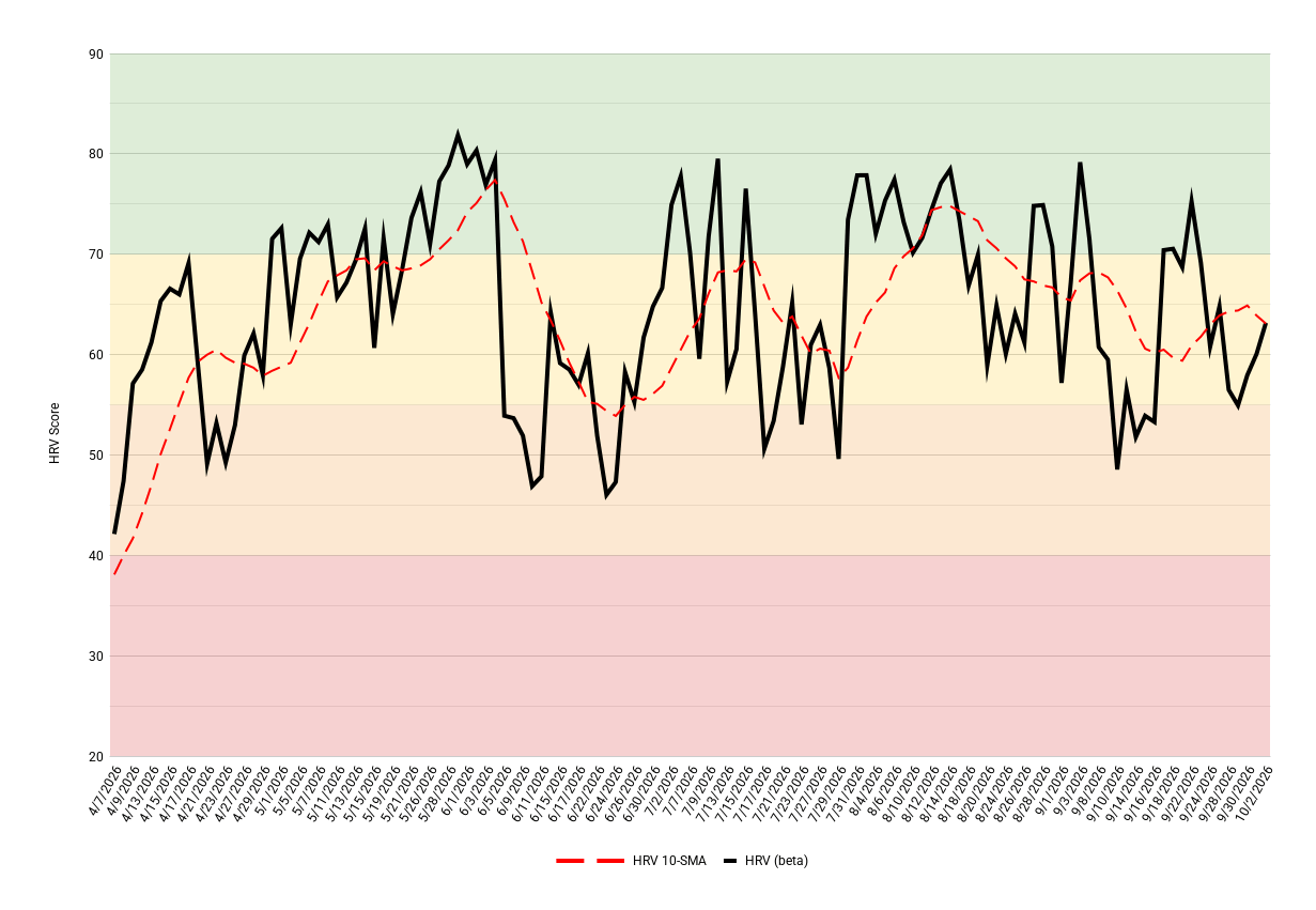
The models are telling two unique stories right now. The Market Heart Rate Variability (HRV) model, which is how I measure the market’s overall health, stability, and resilience, has held up quite well. Besides a dip into the orange zone in mid-September, it has lived in the yellow and green zones since August. The factors that have kept this model looking so healthy are: a continuation of low volatility, low correlation market rotation, and a structurally sound volatility complex. I don’t love that the 10-session moving average (red dotted line) has been printing lower lows and lower highs since it peaked in mid-August, but its short-term trend is higher for now, which is constructive.
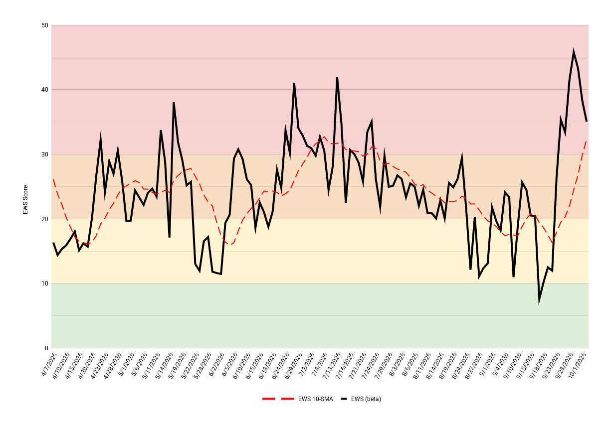
The Early Warning System (EWS) model, on the other hand, doesn’t look so good. This model hunts for dislocations, divergences, and accelerations across a broad array of markets looking for signs of stress. As the output shows, there is plenty of stress in the system. These stressors include: the acceleration of Treasury rates higher; Treasury vol (MOVE index) spiking into the 100s in a few short weeks after lying dormant in the 60s and 70s for months; credit spreads rapidly widening over the past two weeks; and implied correlations sitting at low levels while individual stock vol wakes back up. The chart below says it all. So far, this has yet to spill over into equity indices and equity vol, mostly because the largest companies in the world remain stable and uncorrelated to each other and the rest of the market. Should that change, watch out!
VIX Complex: VIX, VVIX, and VX Futures
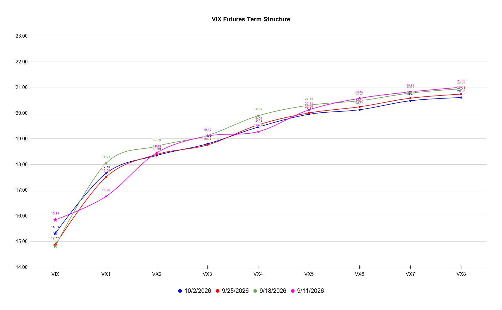
VIX closed the week at 15.30, a far cry from any level that would suggest reason for concern. VVIX finished the week a touch above 87 (snooze fest), and VX futures contango is holding. Spot VIX is a little over 2 vol points below the October VX contract, which is a decent spread with two and a half weeks until October expires. More troubling is the wafer thing spread between the October and November contracts, at only 0.7 points as of Friday’s close. And the further out the curve you look, the flatter it gets. That general configuration isn’t abnormal, but the little amount of cushion is somewhat worrisome. Should equities hit an air pocket and VIX spikes, it wouldn’t take much time for the curve to completely flatten and risk inverting, which would add a tailwind to whatever equity selling caused the flip.
The lack of movement in the term structure over the past four weeks, which you can see below, points to a vol market stuck in limbo. A healthier evolution would show the pink line at the top, the green line below it, the red line below green, and the blue line below red. But as you can see, they’re really just clustered together.
Market mechanics
What we have witnessed in markets for the past few months is exactly why I focus so much on market mechanics and their impact on the volatility market. As breadth has deteriorated dramatically along with stressors popping up in every direction, many market participants and observers have been perplexed by the relative strength in the S&P and Nasdaq. Sure, the Dow and Russell have been sucking wind, but “the market” just won’t crack. I believe that is because on any given day all it takes to stabilize the two largest indices is the stock prices of a handful of the largest companies in the world moving higher. And every day when I look at my basket of mega-caps, there’s almost always a pocket of strength. And when the megas need a day off, strength emerges elsewhere, sometimes just for a few hours, to give one of the megas enough time to wake up. It’s a beautiful thing to watch, and that’s what keeps VIX comfortably living between 14 and 18.
Volatility Composition
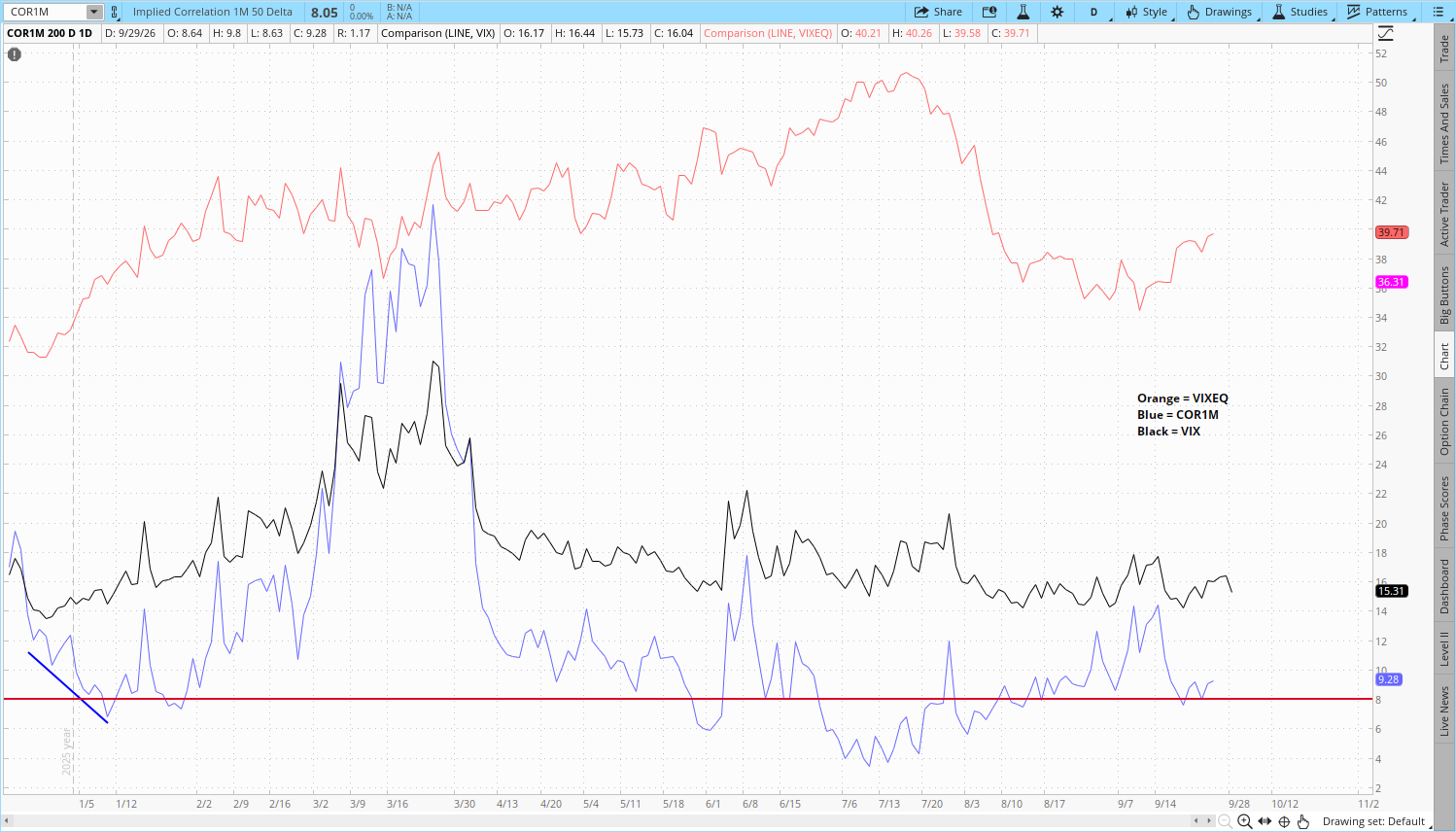
The real impact of the aforementioned mechanics can be seen in the low levels of realized correlation I have been pointing out every week. Low levels of realized correlation lead to low levels of implied correlation, both of which feed into low levels of realized volatility, which puts downward pressure on implied volatility, i.e. the VIX/VOL complex. We can see some of this at play in the below chart of individual stock vol (VIXEQ, orange line), implied correlations (COR1M, blue line), and index vol (VIX, black line).
Implied correlations (ICs) continue to sit at historically low levels. Any readings in the single digits get my attention, and single digits have been the norm for months. The give-and-take, push-and-pull between individual stock vol and implied correlations are what drive index vol. As long as both aren’t rising together, index vol can stay calm. With VIXEQ on the rise again since early September, low index vol is reliant on ICs staying low. As I noted earlier, ICs keeping calm depends on realized correlations keeping calm, which is why so much of my attention is focused on what’s happening with my measures of market mechanics.
Rates & Credit
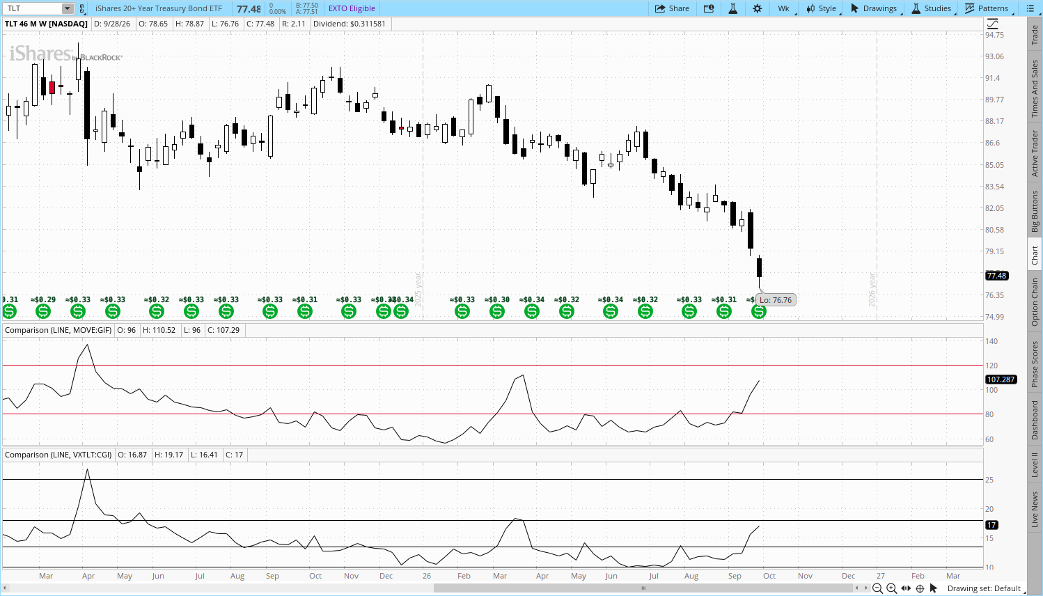
What makes the previously discussed health of the major equity indices even more impressive is that arguably the most systemically important market in the world, the U.S. Treasury market, has been in free fall since the summer. A multitude of domestic and foreign inflationary pressures coupled with staggering amounts of issuance have driven Treasury rates to levels not seen in a very long time. And yet, up until two weeks ago, Treasury market vol, as measured by the MOVE index and VXTLT, was sitting below the normal ranges. This shifted over the past two weeks, but Treasury vol is still below levels we saw earlier this year and in 2025 when rates were lower than they are today.
The below chart shows the popular 20-year Treasury ETF TLT 0.00%↑ in the top pane, the MOVE index in the middle pane, and VXTLT in the bottom pane. There really isn’t much I can add that isn’t already illustrated by the chart.
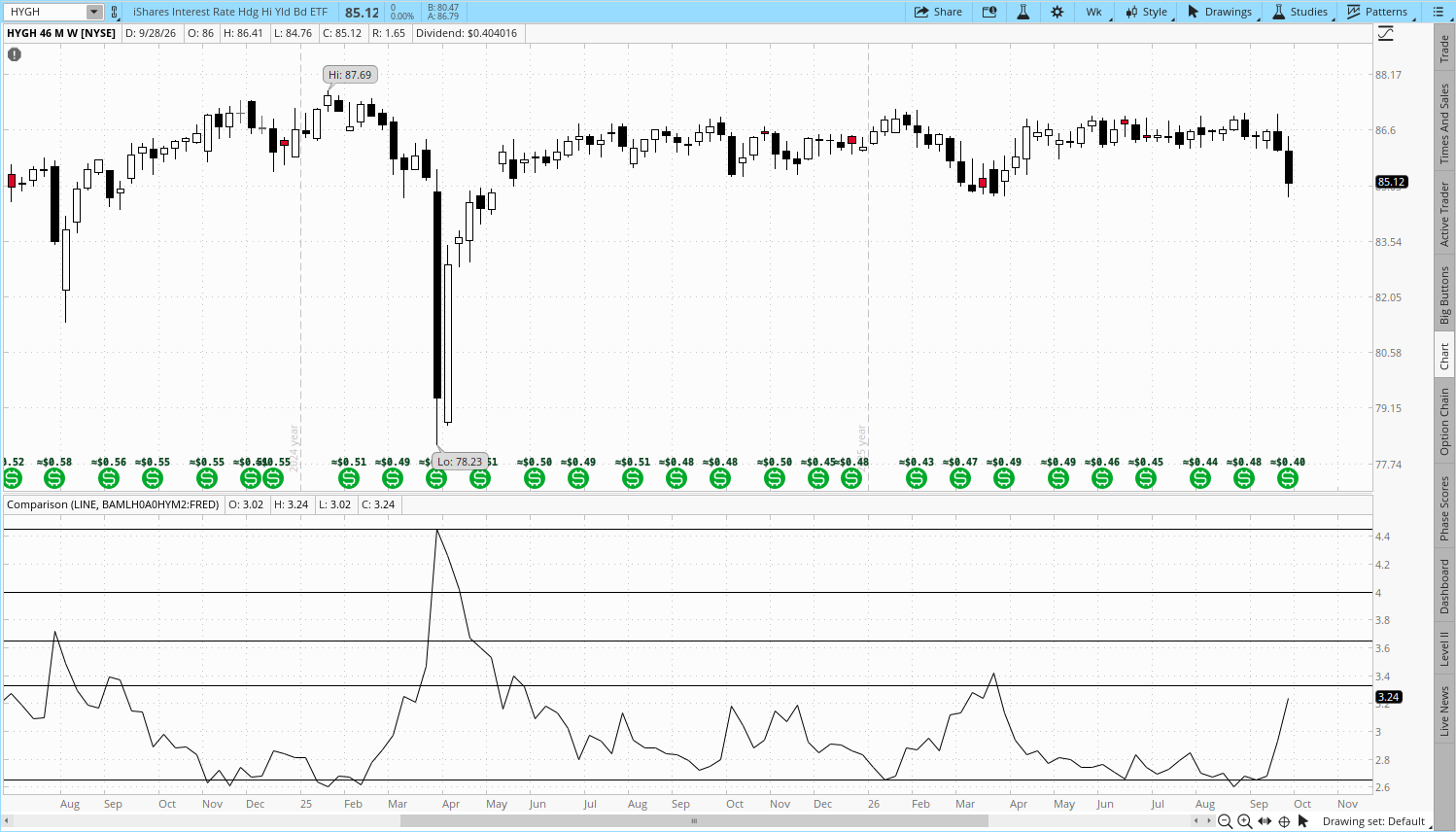
Stress in credit markets also started to ramp up in recent weeks. The first chart below shows the HYGH 0.00%↑ ETF in the top pane, an interest rate-hedged high-yield credit instrument. The interest rate hedge component of the product isolates the credit risk embedded in the underlying bonds. When this product drops, it tells you the credit component is deteriorating. This is also captured by the widening of high-yield credit spreads, which are shown in the bottom pane (a rising line indicates spreads widening).
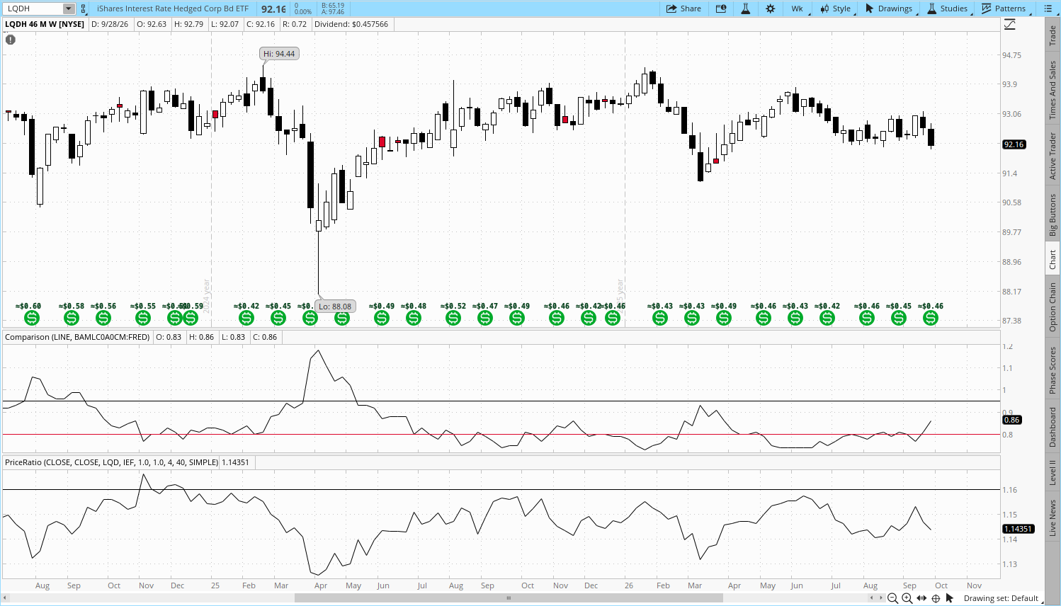
The investment-grade market has held up better so far, but stress is starting to emerge there, as well. The below image shows LQDH 0.00%↑ in the top pane, a similarly rates-hedged product but for the investment-grade market, along with investment-grade spreads in the middle pane. The bottom pane is the LQD:IEF ratio, a favorite risk-on/risk-off indicator for many. The fact that it has spent two weeks dropping is less than ideal.
Final Thoughts
If markets were rational, we, as rational human beings, would have a much easier time understanding them. But they aren’t rational, at least not in the way that makes sense to us. Maybe the point isn’t that we should try to understand markets but rather to accept them. Sure, it’s more comfortable for me when I look out at the landscape and can point to more areas of stability than instability, but that doesn’t mean that’s the way markets should be. And even when those are the conditions, my mind will inevitably start to feel uncomfortable about the comfort, knowing there’s always something lurking behind a corner somewhere.
It’s an incredible thing to witness how the composition of today’s markets is playing out before us. We have a handful of unfathomably large companies each going all in on a pioneering technology yet the movement of their respective stock prices suggests they’re in completely different sectors, industries, countries, etc. And this is happening as sovereign debt markets come under more pressure than they’ve experience in years, conflicts and energy markets are threatening to destabilizing global order, and an El Niño weather pattern is threatening agriculture markets worldwide. Yet, here we are with the VIX barely above 15 and the S&P and Nasdaq barely below their all-time highs. This will mean different things for different people depending on how they play this game, but for my work, it means the most important thing to continue to watch is the co-movement of the largest stocks and the largest equity indices in the world.
See you next week!