“But there is no use kidding: The professionals keep out of switches by waiting for the sound overlay spots. They don’t play the bad races at both ends of the daily programs. They don’t play bad races — period! When they feel the least bit of doubt, they walk away from the mutuel windows and step into the bar for a leisurely drink that will last until a better spot comes along. ” ~ Robert L Bacon
Good morning!
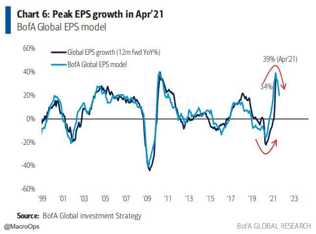
In this week’s Dirty Dozen [CHART PACK] we look at the fastest inflation increases in nearly 40-years. Check out peak EPS and turning secular wage growth, before going through each of the reasons why bond yields are falling. And finally, we end with the long mean reversion pitch for USDCAD and a bullish technical setup in a US defense contractor, plus more…
Let’s dive in.
***click charts to enlarge***
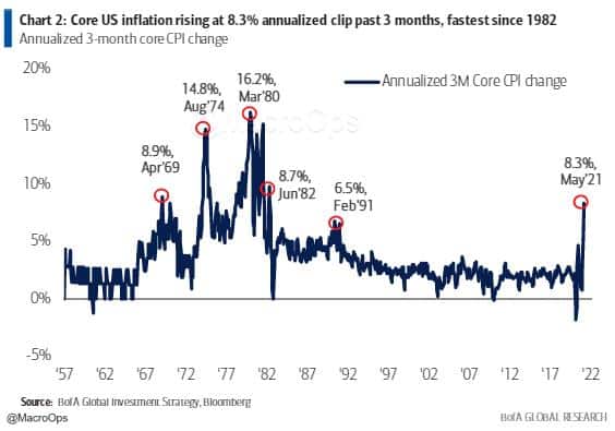
- Core US inflation has risen at an 8.3% annualized clip over the past 3-months. That’s the fastest pace since 1982 according to BofAML.
There’s no shortage of opinions on where inflation is headed over the next year. Personally, I’m more interested in understanding where the consensus narrative is shifting relative to the probable distribution of outcomes. There’s more edge for me in fading the herd versus predicting something as complex as the general price trends of nearly all goods and services 12-months out.
- Regardless, I think the trend in large companies significantly raising their minimum wages is important. We’re coming off secular lows in the lower-end wage share of GDP. The political landscape has shifted materially in the direction of us not resuming the march towards greater inequality. So that bit is unlikely to be transient (charts via MS).
- Via the latest BofAML Flow Show which sounds about right to me:
“Risk vs. reward: sentiment now ‘it’s a free call option on credit & stocks’ until “return-to-office” Sept payroll (released Oct 8th) and return of Goldilocks as macro cannot get any hotter (combo of inflation & labor shortages at US small businesses highest since 1974); we say wage growth means lower yields transitory & H2 stagflation means risk-return for stocks (+3-5% vs -10-15%) poor.”
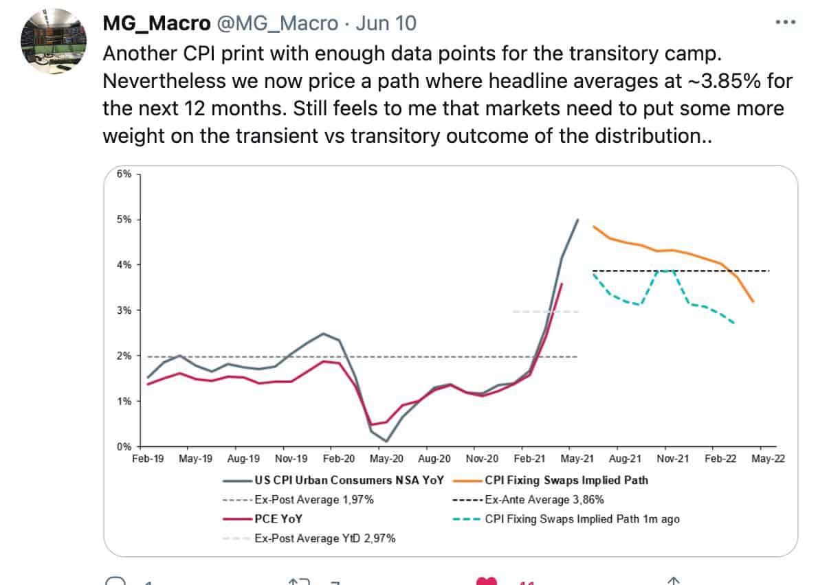
- I think @MG_Macro is spot on with the below. The market is too overweight the transitory narrative (ie, high inflation will soon revert back to trend after bottlenecks are resolved) versus the more probable transient outcome (ie, data only slowly converges back towards trend and at a slightly higher level).
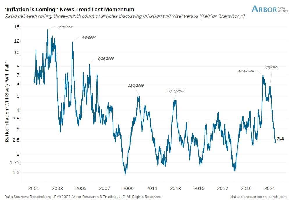
- This narrative dynamic is sort of captured in this great chart from Arbor Data Science. The graph shows the ratio between the number of articles discussing inflation will “rise” versus “fall” or “transitory”. It’s the swing of the Narrative Pendulum…
- In spite of the recent beats in inflation data, yields on USTs have actually dropped… I love when the “No-Sense Algorithm” is at work. And of course, this move in yields does make sense when looked at from a relative value, positioning, and technical standpoint.
Remember this chart that I shared back on March 22nd, at the highs of the move in yields (link here)? I argued that yields were historically stretched above their 40-day MA and at levels that marked reversion points in the past. Which has so far played out to a T…
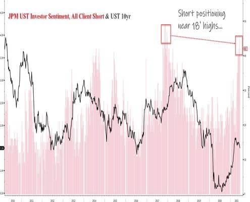
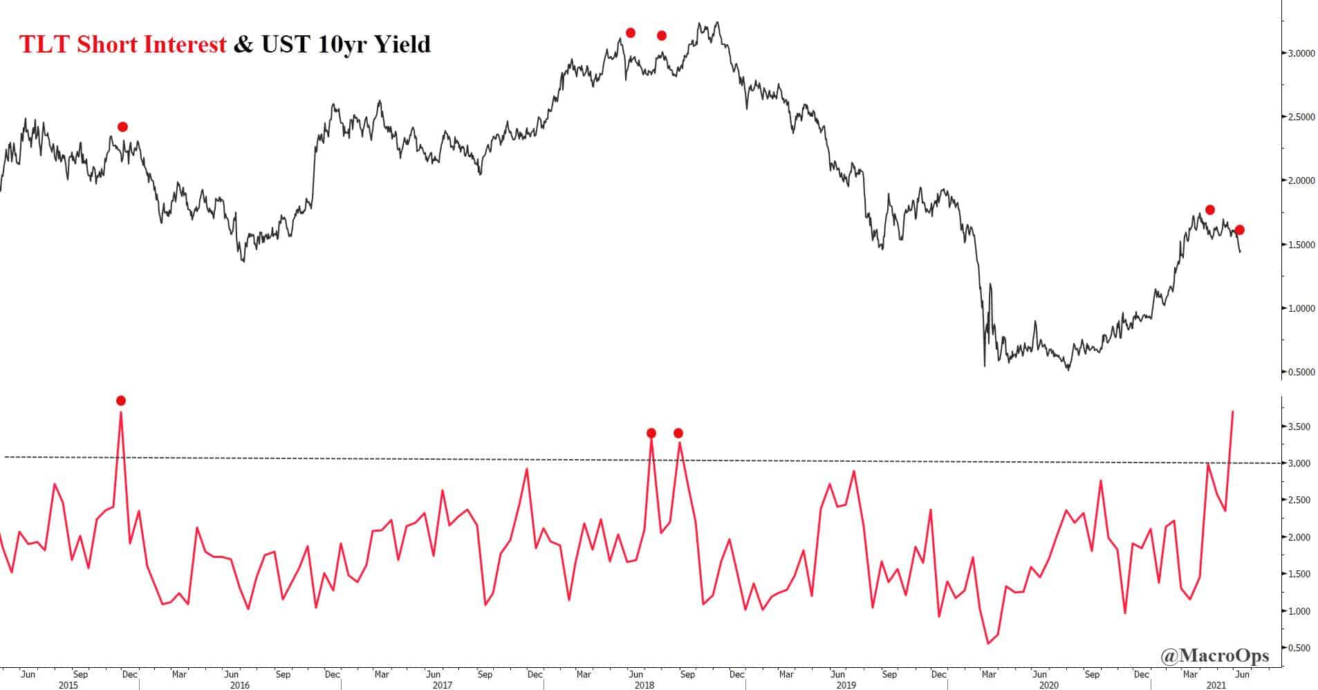
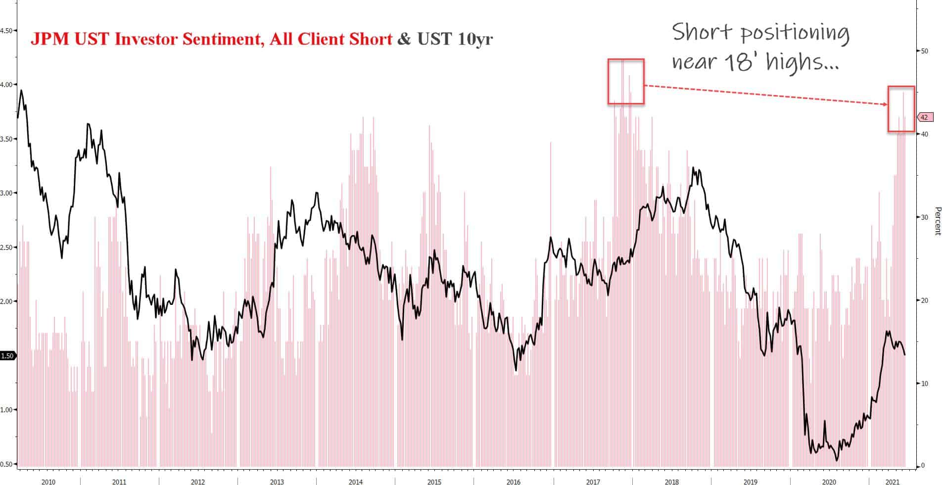
- In addition to stretched technicals, short positioning recently hit extremes…
- And the higher relative US yields made UST’s more attractive to European investors on an FX hedged basis.
As soon as the above (techs, positioning, rel-value) resets, we’ll see the yield curve resume its steepening.
- Aggregate USD Net Commercials have their largest short position in 10-years. The last time commercials were this short, it marked the start of the USD bull market.
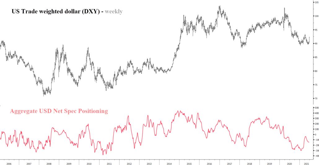
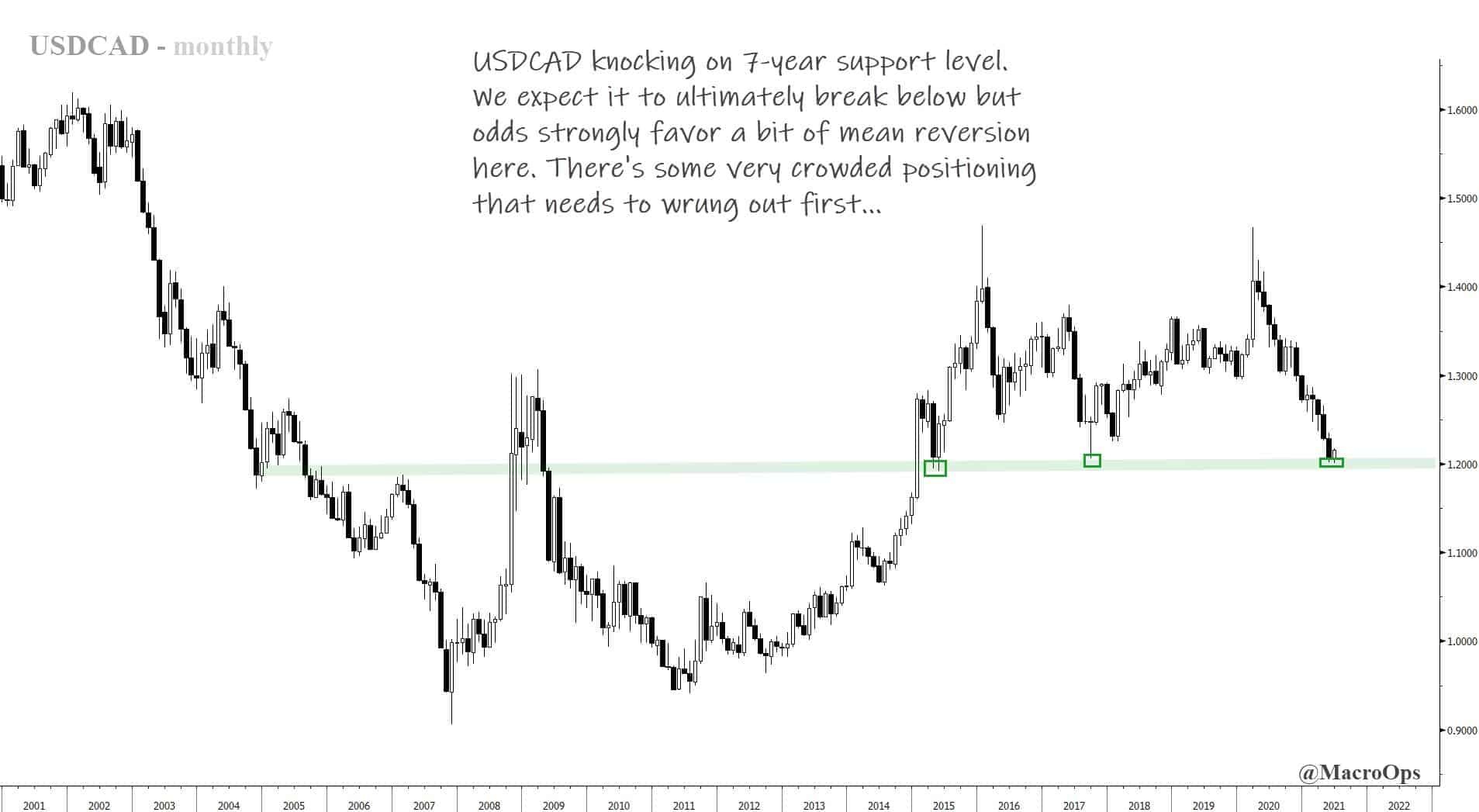
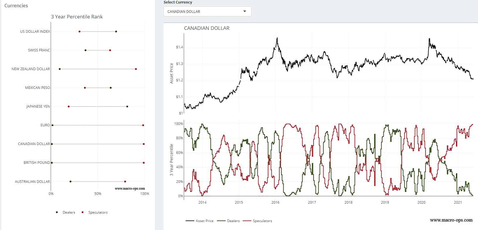
- USDCAD in particular looks vulnerable to some tradeable mean reversion. The pair is very overextended… It’s also knocking on a 7-year support level and spec positioning is in the 99th %-tile. Plus, it’s breaking out to the upside on the daily.
11.Citi’s FX Pain Index – CAD shows the pain trade is clearly higher in the USDCAD pair. Though it’s important to point out that stretched positioning can remain stretched for long periods of time — as recent history shows. That’s why you need confirmation from the tape. This is especially true when playing counter-trend moves, which I think this is.
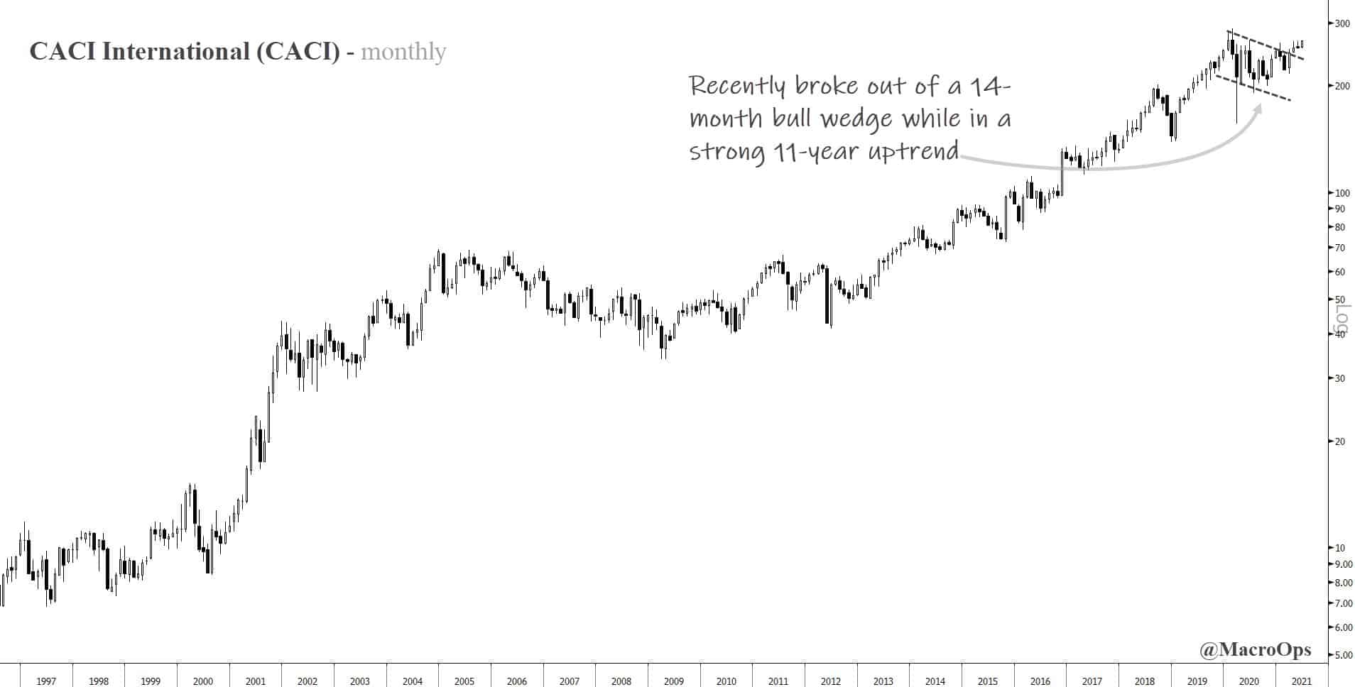
- CACI International (CACI) popped up on our long-term compression screen. This screen looks for stocks that are undergoing historically significant periods of price compression. We see these plays out because compression regimes tend to signify strong consolidation which is why they act as springboards for trending expansionary regimes.
The chart below is a monthly.
If you enjoy reading these Dirty Dozens each week then please feel free to share them on the Twitters, forward them to a friend, or translate them via smoke signal… Every bit helps us get our name out there.
Thank you for reading!
Stay safe out there and keep your head on a swivel.

