History is hard to know, because of all the hired bullshit, but even without being sure of ‘history’ it seems entirely reasonable to think that every now and then the energy of a whole generation comes to a head in a long fine flash, for reasons that nobody really understands at the time—and which never explain, in retrospect, what actually happened… ~ Hunter S. Thompson
In this week’s Dirty Dozen [CHART PACK] we again look at the relationship between record money printing and stocks. We then talk about the technical overextension in tech and the deep relative value on offer in banks and energy stocks. We end with some charts on sentiment and show an analog of where we might be at today.
Let’s dive in.
***click charts to enlarge***
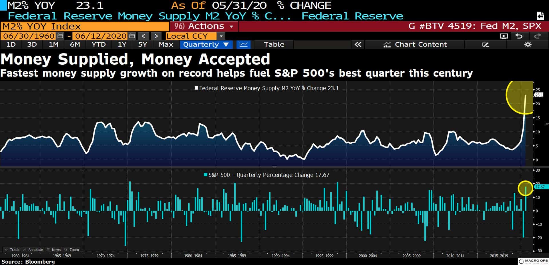
- I often talk about the important role of money (cash + credit) on the demand side in the supply and demand equation for financial assets. So we shouldn’t be under the illusion that it’s just some kind of coincidence that we just saw record money growth and the SPX’s best quarter of this century.
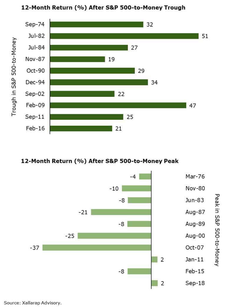
- Allen Sukholitsky, commented on the demand side of this causal relationship recently, writing “Short Case for Long Stocks. It’s not based on fundamentals (there aren’t many). It’s based on money (there’s plenty). The stock market rises an average of 31%, one year after a trough in S&P 500-to-money. The minimum return? +19%. One year after the ratio’s peak, the S&P 500 averages -12%. The maximum return? +2%. This past December and March appear to be a peak and trough, respectively… Relative to the economy, equities currently make little sense. But relative to money, equities make much sense.”
- According to NBER as well as BofA’s US Regime Indicator, the US is currently in a “Phase 4” technical recession.
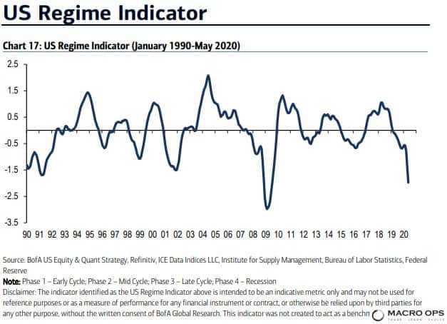
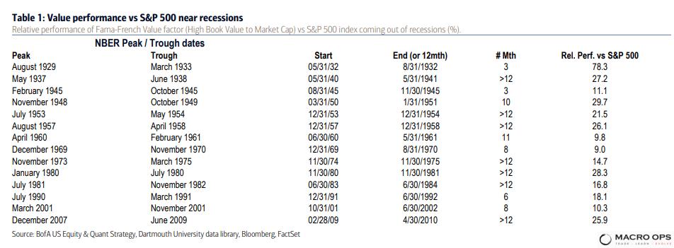
- BofA shared the following tables showing which styles perform best at various phases of the indicator. And also the relative performance of value versus the SPX near recessions. If we are in Phase 4 and presumably moving into Phase 1 next, then value stocks might be a good area to start focusing your energies on.

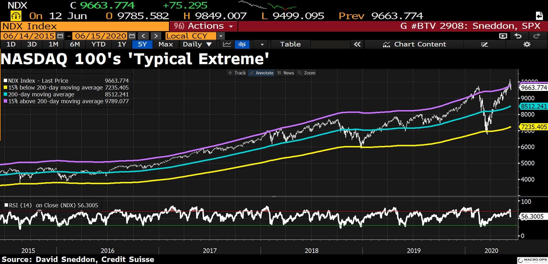
- The opposite case can be made for high growth names such as those that dominate the Nasdaq. This BBG chart shows that the tech index is over 15% above its 200-day moving average (purple line). The tape is quite stretched and we shouldn’t be surprised if we see some mean reversion in the coming weeks.
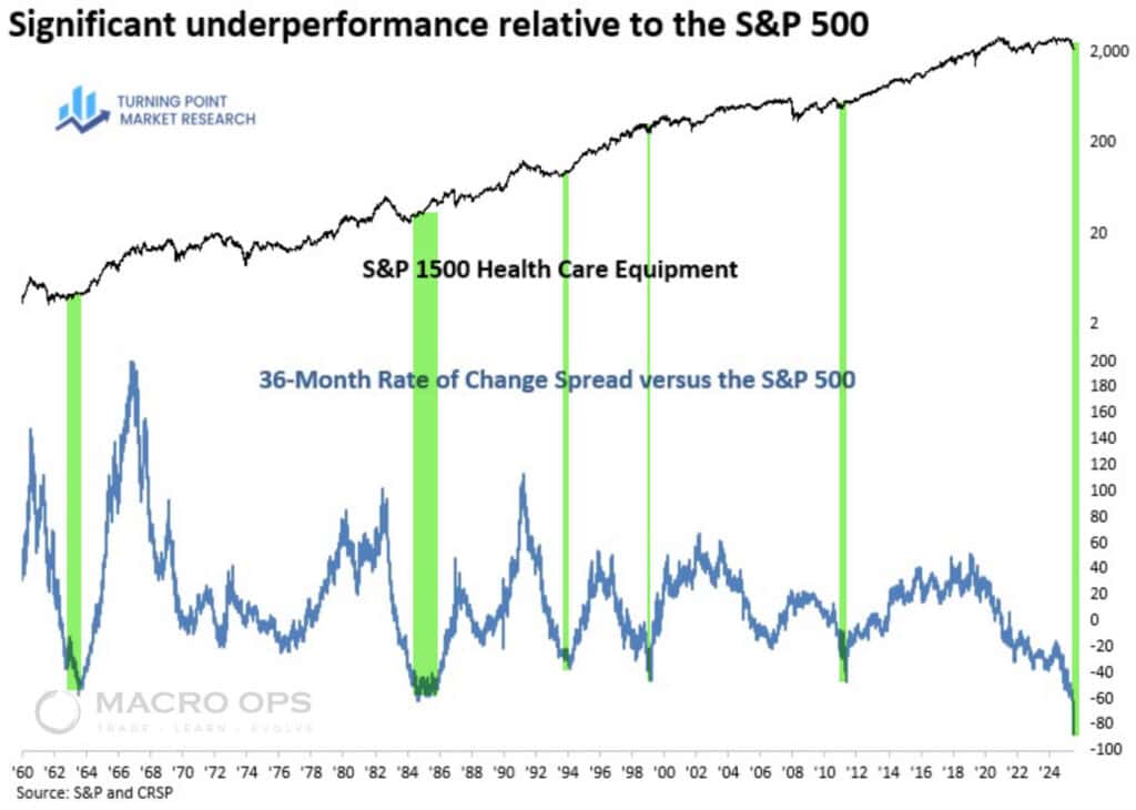
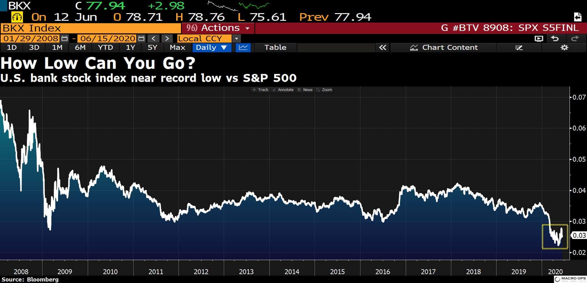
- Speaking of value, US bank stocks are near their lowest levels ever on a relative basis against the SPX index.
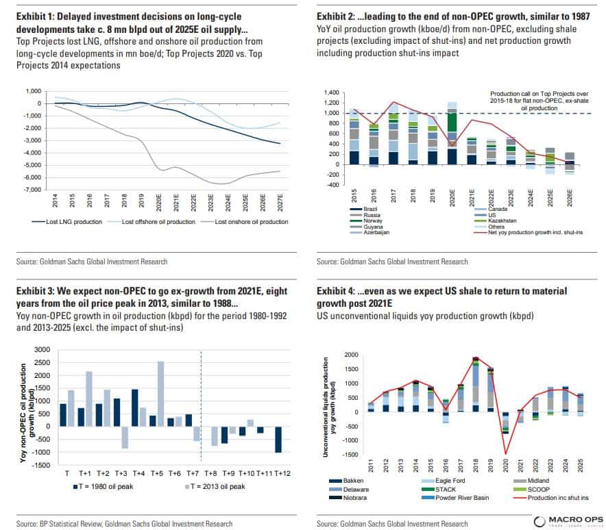
- Oil and gas stocks are another area where we are seeing a lot of great deals (if you know where to look). Goldman Sachs commented on the improving supply and demand fundamentals for the sector in a note recently, writing: “Is 2020 just a pause in non-OPEC oil production growth? No, we believe we have come to the end of the delivery cycle of the 2010-14 mega-projects and non-OPEC structurally stops growing in 2021, as it did in 1988, eight years after the end of the previous capex cycle. This opens a new phase of structural OPEC market share gains, similar to 1988-2000.
“Is the under-investment in oil & gas cyclical or structural? We believe the under-investment is structural, driven by rising shareholder pressure on climate change (approval rate of climate-change shareholder proposals has tripled since 2011), driving hurdle rates for new oil projects to 20%, up from 10% in 2013-14. US shale shows a stronger element of cyclicality, driven by its short-cycle nature.”
- Here’s a new way of looking at AAII sentiment that I hadn’t come across before. BofA calls it “Farrell Sentiment”, which I assume is named after the legendary market technician, Bob Farrell — here’s Bob’s “10 Rules” if you’ve never read them before. The indicator is constructed by taking the 10-week moving average of AAII Bulls divided by the sum of AAII Bears and 0.5 times AAII Neutral.
Currently, it shows that investors are very bearish.
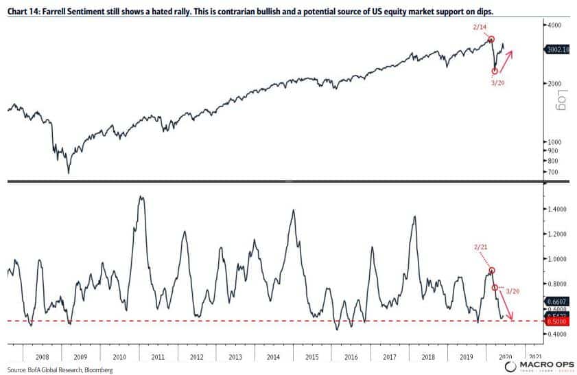
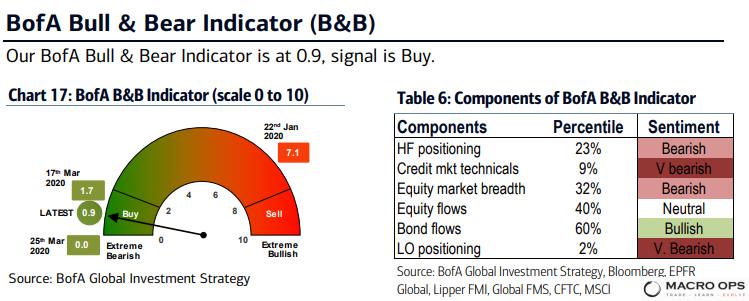
- But…. they’re becoming less so. If only by very tiny increments. BofA’s Bull & Bear indicator lifted off of zero last week for the first time in a looong time. Though, it’s still showing extreme bearishness and giving a buy signal.
- Also, BofA’s Private Client Sentiment Indicator, which measures ETF positioning in “EM/DM, Value/Growth, Small/Large, Cyclicals/Defensives, Stocks/Bonds + cash levels”, is also showing what can only be considered as extreme bearishness.
A lot of people have been pointing to the Robinhood traders getting active in the market for the first time, as a sign to be bearish since they are the penultimate “Dumb Money”. I have a different take… I think everyone is the dumb money and the time to worry is not when a bunch of Robinhooders are getting bulled up but rather when the suits and ties on CNBC and their money manager guests are seeing nothing but blue skies ahead.

- Here’s another way of looking at the fear in the market. This chart from BofA shows the 10-week moving average for the 3-month VIX curve. BofA comments on the chart, saying the curve “is coming off a big contrarian bullish oversold level similar to late 2008 and early 2002, which we view as a positive backdrop for US equities.”

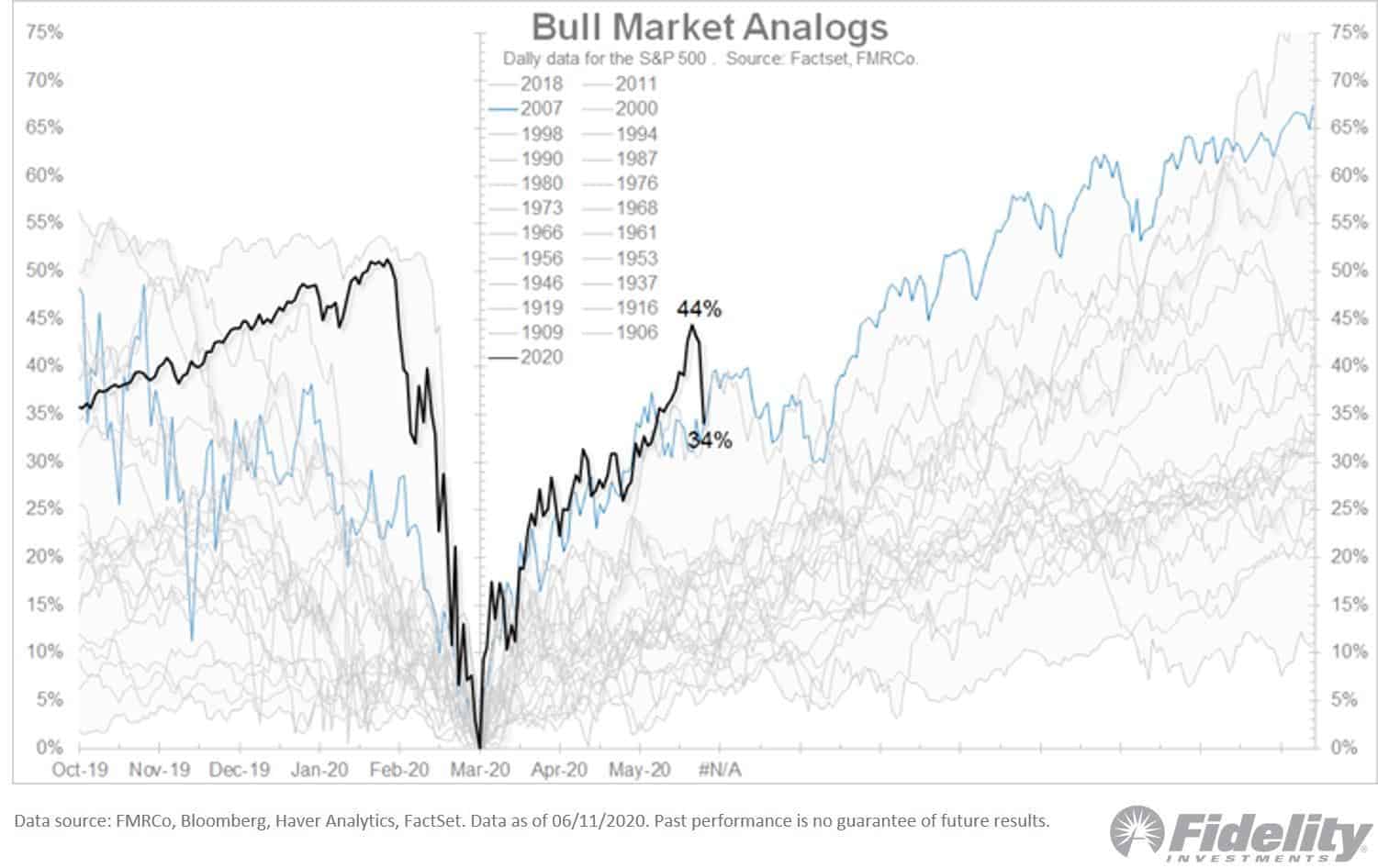
- I’m personally not big into analogs but I thought this chart from @TimmerFidelity was too interesting to not share.
Stay safe out there and keep your head on a swivel.