

Things Aren’t Quite As They Seem…
Back in March following several hotter-than-expected inflation prints, it became quite popular amongst the pundit class to spread alarm over a reacceleration in inflation. We at MO took the other side of that trade and argued for a continued trend down below 3%.
I’ll share what I wrote in our Collective Slack group at the time as it’s a helpful lead into where I believe the economy (and markets) are headed next as we advance into the second half of this year.
Gotta stick with first principles on this. Here's the quick skinny on how I look at (1) cyclical (2) secular and (3) inflation volatility. Cyclical inflation is largely driven by the risk/business cycle (ie, credit creation, capacity utilization, labor slack, etc.), USD/oil trend, and rate of change. These cyclical dynamics are illustrated in the graph below.
Oil isn't doing much, and the USD is keeping a bid. More importantly, there are increasing signs that the labor market is cooling (quits rates, small business sales, etc.) are trending down and the ECI is in a clear downtrend showing cooling wage growth (another sign of increasing slack). We can also look at estimates based on actual wages earned, and on taxes paid into UI coverage, and these numbers show that wage growth is dramatically slowing down.
And for us to see cyclical inflation reaccelerate here -- I'm not talking about 2-3 months of small increases but a real trend change -- we'd need to see these dynamics in the labor market change. And I'm not sure how that's going to happen anytime soon, especially since we had roughly 3mn migrants cross our borders in 23' and this year we're expecting an even higher amount. This is adding to our low-end labor pool, which will just further help depress wage growth (but, on the other side it's helping to boost OER and keeping the housing market tight so maybe it’s closer to a net out in impact).
Secular it’s all about demographics and what's called the consumption-supply gap. Many wrongly assume that an aging demographic is deflationary, but that's not true. An individual imparts an inflationary force twice during their lifetime. The first is during childhood when consumption exceeds labor and then during retirement. A higher consumption/supply gap has a greater inflationary impact, via wages, and vice-versa (see charts below).
The C/S gap was deflationary during the 10s but is now inflationary through early 2030s (chart above). But the big difference between now and the 60s / 70s when the C/S gap was this positive, is that capital still holds a LOT more power than labor (union membership as % of the labor force is just 10% today vs 25% in the 60s/70s).
So the inflationary power of this demographic secular trend won't be as potent as it was the last time — at least not until this power dynamic dramatically shifts. So my base case is that this means the old inflation ceiling is the new floor and we likely see inflation chop around in the 2-4% range, which the Fed seems mostly fine with. But I don't see anything on the horizon that can drive us materially above that.
The last one is inflation vol. This is the one that matters most for markets. There's been some good research on this (I'll post the papers when I get back to my desktop). But we're also likely in a new normal of higher inflation vol due to greater geopol variance (which is only likely to increase) as well as greater populist politics.
So my inflation take is mixed. I think we probably trend down a bit more over the interim, but not too much. But we also don't see CPI reaccelerate either. The old ceiling is the new floor. Fed is cool with that. Expect higher inflation vol.
Lastly, one of the big unknowns on the horizon is whether China lets CNY depreciate. If they do, and I'm in the camp that believes that's an increasing probability, it'd unleash a deflationary impulse throughout the world. So we'll see... lots to watch out for.
The warnings from the inflationistas at the start of the year have proven wrong with CPI falling to 3% in June and PCE to 2.6%.
This was due to a further normalization of price pressures on the supply chain side along with a further deceleration in wages as the labor market continued to cool. Again, this wasn’t difficult to predict if you just focused on the first principles mentioned above.
This downshift in both the inflation and labor market has driven the Fed to start readjusting policy expectations with the market now pricing in 2-3 cuts this year, with the first due in September.
And this easing of financial conditions is helping to prop up an increasingly expensive market. SPX and QQQs are trading at TTM PE of 26x and 34x respectively.
The question we must ask ourselves now is what is the path forward for growth, inflation, Fed policy, and subsequently markets?
This is what I want to explore in this short note. We’ll start with an examination of the labor market. And in our follow-up note, we’ll jump into shifting underlying inflation dynamics, and end with a look at two major inbound wildcards and how they might dramatically change the underlying dynamics.
As pointed out in the above, the labor market has been slowing/normalizing since the beginning of the year. And this slackening has only accelerated in recent months.
This fact though has flown under the radar for most due to a discrepancy between two of the major employment surveys. These are the establishment's non-farm payroll numbers and the household employment report.
The establishment survey has painted a picture of a red-hot labor market throughout the first half of this year, routinely surprising estimates to the upside. These beats became a pillar of the consensus helping to swing the narrative pendulum far into the “higher for longer” camp by mid-Spring.
While the Household survey has shown a clearly weakening labor market. For example, the establishment survey says we’ve seen over 1 million jobs created since the start of the year. While the household survey shows a decrease of over 100k jobs since Jan 1st.
We can see this discrepancy clearly in the chart below. The bottom orange line shows the establishment numbers minus the households is at a level seen only twice, during the COVID recession and the top of the 2000 tech bubble.
At MO we’ve known to focus on the latter because we look at a holistic multi-view set of data points, in order to triangulate to Truth. And by using this process it’s been clear that the establishment survey was grossly overstating job growth and that both the household survey and unemployment rate were providing a clearer picture of what was actually going on in the jobs market.
To illustrate this point, it’s important we first quickly explain some of the key differences in how these two surveys (the establishment and household) are put together.
Both are monthly surveys conducted by the BLS. The establishment survey samples over 650K employers, while the household samples 60k households. Those who hold more than one job are counted multiple times in the establishment survey, while those in the household survey are counted just once.
The surveys are then constructed using different models in order to aggregate up to an estimate for the broader country. The household survey does this using estimates for the current population. And the establishment does this via estimates of business births and deaths.
It’s the difference in these models that is key to the wide divergence between the two data points. If you’re a wonky nerd and would like to learn more about these data sets you can read this primer from the BLS’s website (link here).
You see, the establishment’s model relies on assumptions around the birth/death rate of businesses. And the BLS has assumed a higher net birth rate relative to the pandemic.
The chart below shows the net birth/death assumptions from the BLS, smoothed in a 12m average. We can see that the BLS is baking in a generous business backdrop which is interesting considering that rates are at 15yr+ highs, bankruptcy filings are on the rise, and small business sentiment is near multidecade lows (NFIB small business outlook for example).
If we assume a net level of births and deaths that’s closer to the pre-pandemic period — which is conservative considering the above — then job growth naturally gets revised downward, and quite significantly so.
Economists at BBG used alternative data from Homebase, a small business payroll company, to confirm this error.
BBG’s Anna Wong writes that “nonfarm payrolls are overstated, and will continue to be so until the forecasts the BLS’ ‘birth-death’ model uses to adjust payrolls take account of the sharp slowdown in business entries since mid-2023, and the rise in business exits.
“Making proper adjustments, we think… the 12-month moving average pace of hiring was just 61k per month in May - well below the 100k neutral job growth pace cited by Fed Chair Jerome Powell or the 250k estimated by a Brookings institution paper.”
ABN AMRO, a bank, is a bit more sanguine. They estimate year-to-date payroll growth of roughly 90k per month. However, this is still significantly less than the BLS’s estimate of 247k and below the Fed’s estimated pace of “neutral job growth” needed in order to keep unemployment from rising. You can read ABN AMRO’s breakdown of the labor puzzle here.
Our estimates for job growth are in the middle of the two above, say roughly 80k a month. Regardless, we’re less interested in specifics and more interested in where and how the consensus of our Game Masters (policymakers, Fed, etc…) may be wrong.
And the Fed’s overly optimistic read on the labor market seems to like one of these situations and they are only now just maybe starting to wake up to that fact.
Now, we should mention that there is another factor that’s making this data somewhat a tough read. And that’s immigration. We don’t have exact numbers on this as estimates range from as low as 1mn to as high as 3mn migrants in just 2023 alone.
And so it’s possible that the household survey isn’t properly accounting for this influx of workers, while the NFP data does a better job. But, again, we don’t see that in the alternative data and we see a general weakening in the other labor market data points we track (ie, temp payrolls, quits, wage growth, etc…
Furthermore, we only really need to turn to the unemployment rate to get a clearer picture of what’s going on in the labor market. That’s because the above model assumptions cancel each out in both the numerator and denominator of the UR. So this makes it the cleanest signal we have for the health of the current labor market.
The June UR rose to 4.1%, which is already above the Fed’s end-of-year SEP which forecasts a UR of 4%.
So what does all this tell us?
Well, it appears the actual run rate of job growth is lower than what’s being portrayed by NFP, and below the level needed to keep unemployment from rising. This means, all else equal, we should expect unemployment to continue to rise into the end of the year, triggering a recessionary signal in the Sahm Rule before December if its current trajectory is allowed to continue.
And this is where things get tricky because the business cycle is ultimately driven by feedback loops between spending, which in turn is driven by wage and credit growth, and the rate of unemployment. More people without jobs begets lower spending which begets more people without jobs.
This is one reason why the Fed’s job is so difficult because they’re operating off of old data and using tools that work through a long lag. Meanwhile, these feedback loops can quickly become self-reinforcing, which is why they’re called feedback loops.
Simply put, monetary policy is too tight. We can see in our chart below that Real GDP (orange line) is about to cross below the Real Fed Funds rate (white line). When that happens it’s a good barometer of Fed policy that’s chucking sand into the gears of the economy and why past instances have tended to precede a recession.
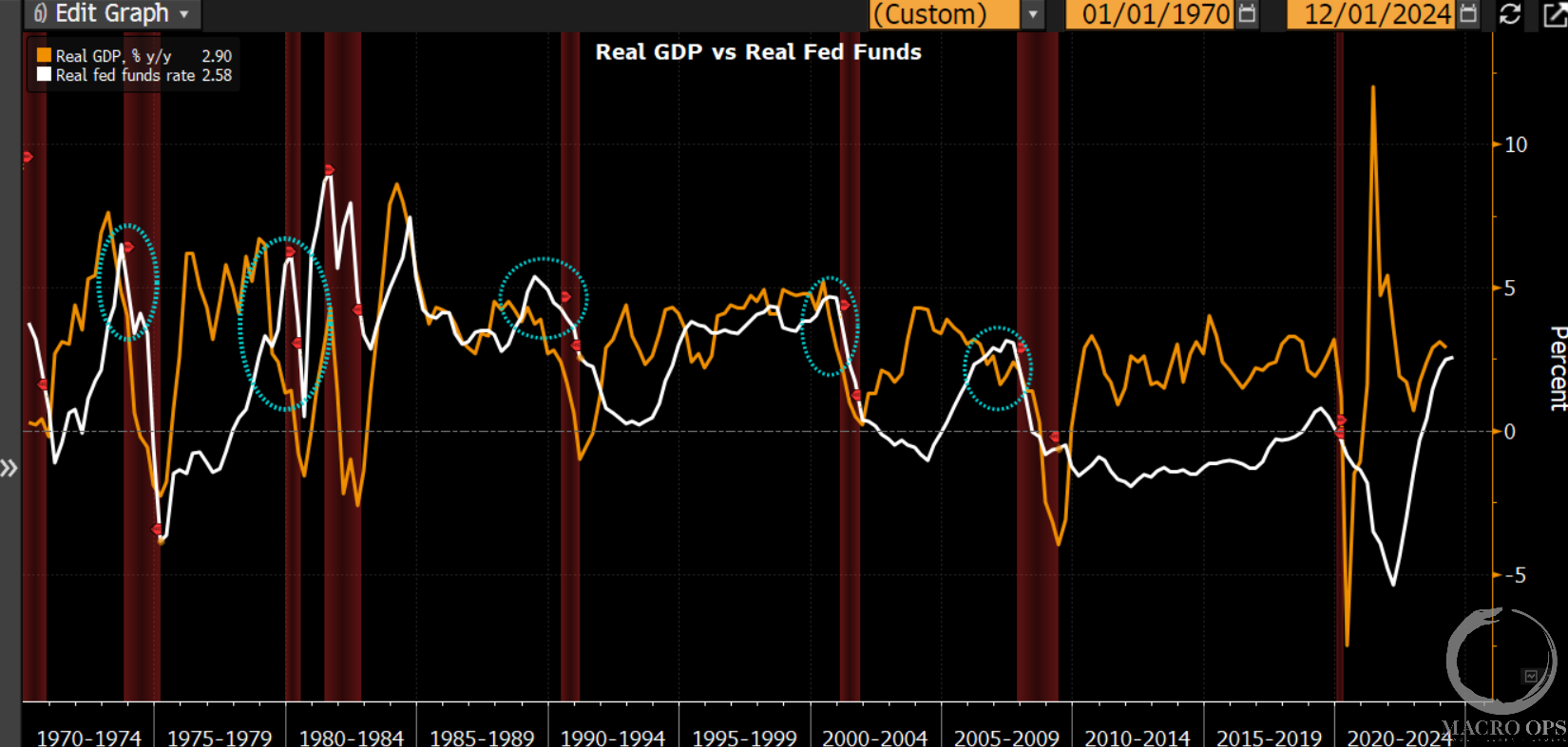
This isn’t to say we’re calling for a recession or turning bearish on the market. That’s not the case (yet). The labor market is cooling but it’s still more in the healthi’er normalization phase than it is in the tripwire feedback one. With that said, the Fed may have to turn more aggressive in cutting rates when they realize that the labor market is not nearly as strong as they once thought.
And nobody knows where the ephemeral neutral rate of interest is, exactly. But it’s safe to say that it’s well below 4.5%, and probably closer to 3.5% which is much lower than where it currently sits at 5.5%. And until the Fed gets rates to that level, the economy is going to continue to slow which will inch the labor market closer and closer to that tripwire point where the feedback loops kick in.
All this gives us a number of quite divergent paths. In one, the Fed reads too much into the NFP data and is too slow to adjust, sending the economy into a recession by early 2024. In another, the Fed starts lowering rates much more aggressively than what’s currently priced in by markets, staving off recession and sending risk-assets soaring.
There are a number of market implications dependent on which path the Fed ends up tracking. We’ll explore what these are along with some potential wild card surprises in our next note. Until then…
Enrollment into our Collective is open until the end of this week. The Collective includes all of our research, a full library of reports and videos on theory and strategy, our proprietary market dashboard, plus our internal slack where the team and I, plus fund managers and die-hards from around the world talk shop, exchange ideas, and shoot the shit. Our book is up +40% ytd and if you’re interested in joining our crew, just click the link below. Looking forward to seeing you in the group.