“Incorporating percentages or ranges of alternatives into the expression of our beliefs means that our personal narrative no longer hinges on whether we were wrong or right but on how well we incorporate new information to adjust the estimate of how accurate our beliefs are.” ~ Annie Duke, “Thinking in Bets
In this week’s Dirty Dozen [CHART PACK] we look at Imperial Fiscal-Monetary regimes, improving data surprises, a setup in natural gas, and a deep value mining play, plus more…
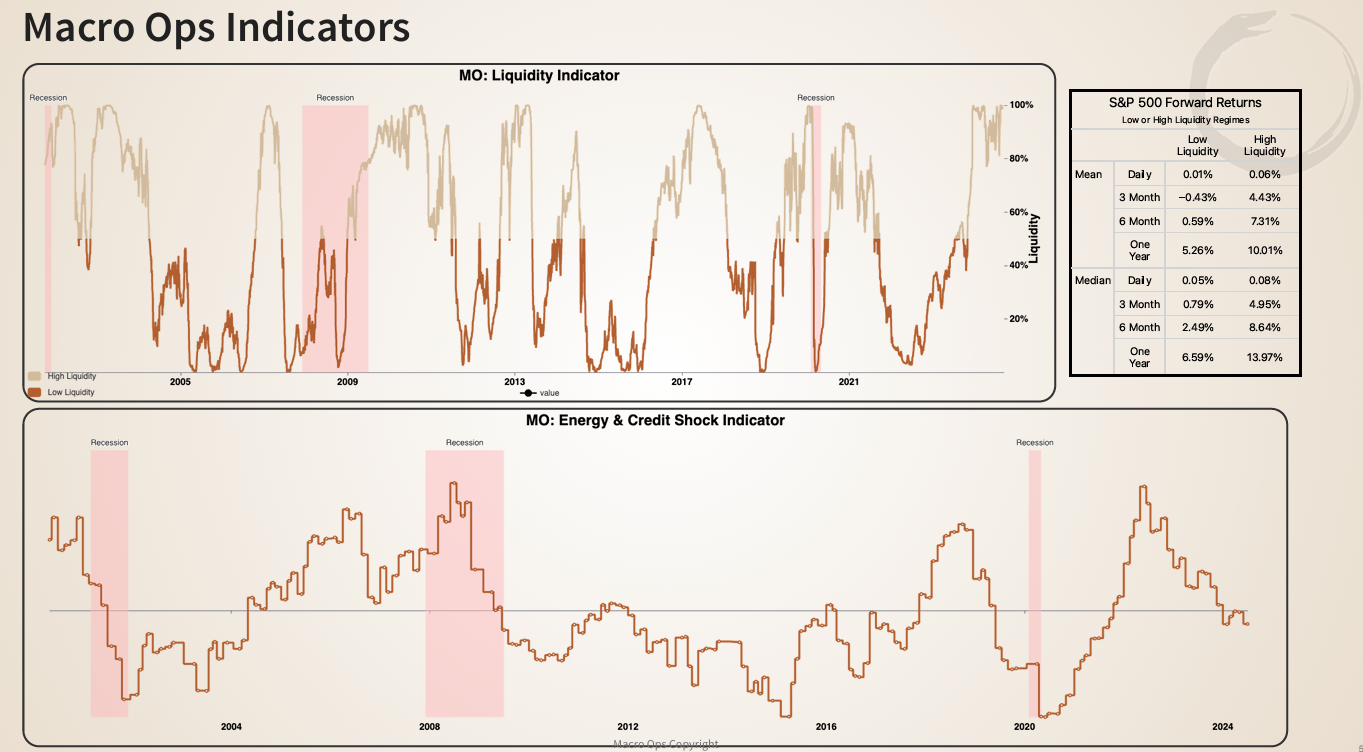
1. Our MO Liquidity Indicator is back at its 100th percentile. This indicator is a composite of market and financial condition data points. A high reading means liquidity is flush (financial conditions are loose). The table to the right shows that higher readings correspond with strong forward equity returns.
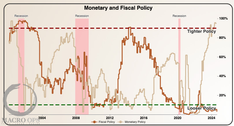
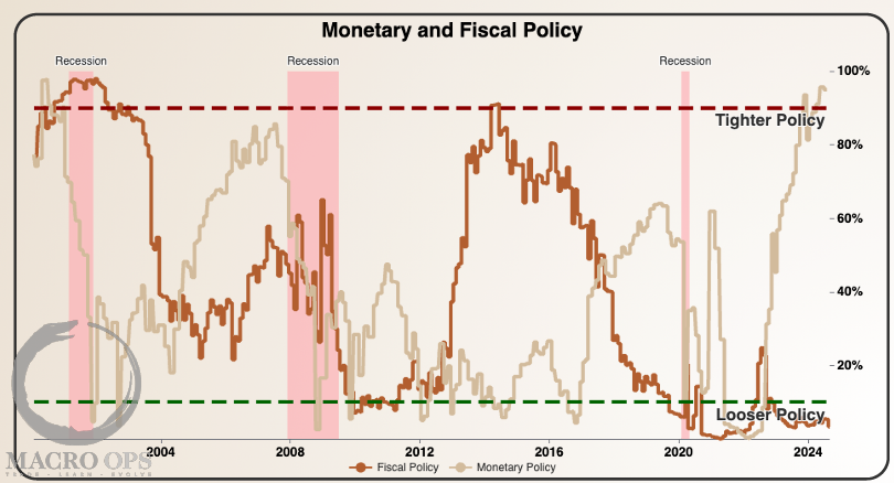
2. Tight monetary policy mixed with loose fiscal policy is what George Soros called the “Imperial Circle” when the Reagan administration ran a similar regime. This regime is typically marked by outperformance in the core vs. periphery (US vs. rest of the world) and a strong dollar. With the Fed now entering a cutting cycle, we will likely transition to a Vicious Circle soon.
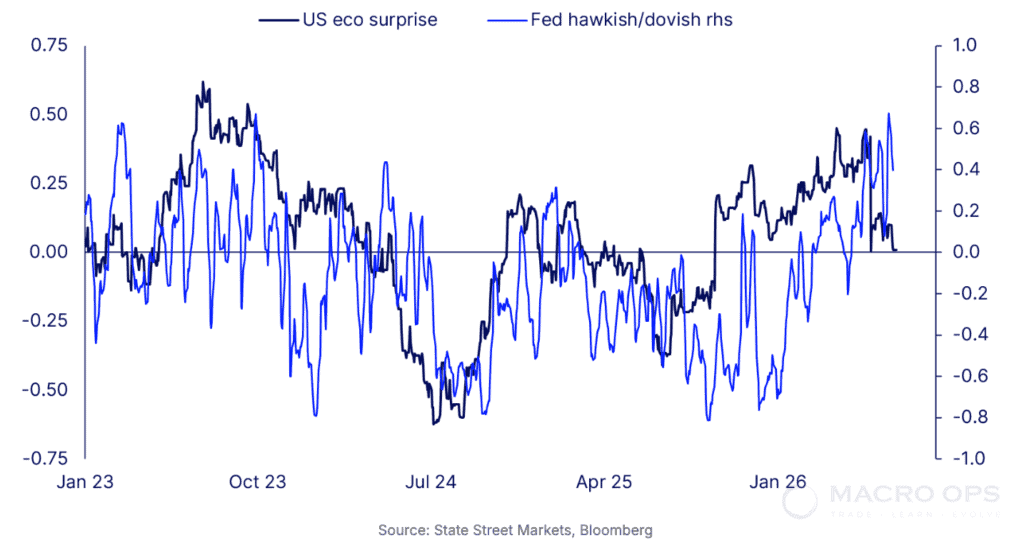
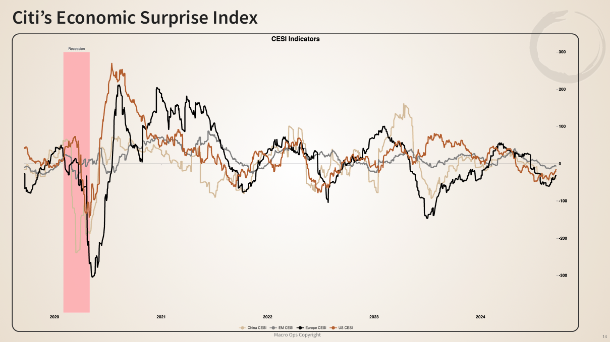
3. Citi’s Economic Surprise Indices (CESI) for China (tan), Emerging Market (grey), Europe (black), and the US (orange) have been deeply negative since Spring. Consistently negative economic surprises drive a bearish swing of the Narrative Pendulum and a subsequent shift in positioning.
But surprises are starting to turn up. This will drive a bullish swing in the pendulum as repositioning drives risk-on over the coming months.
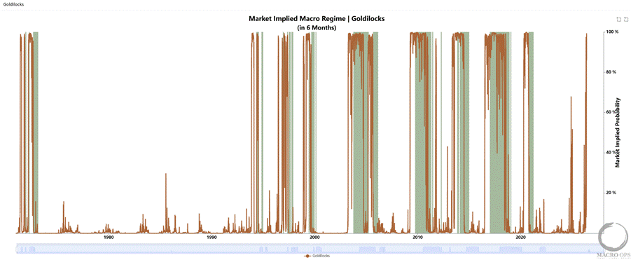
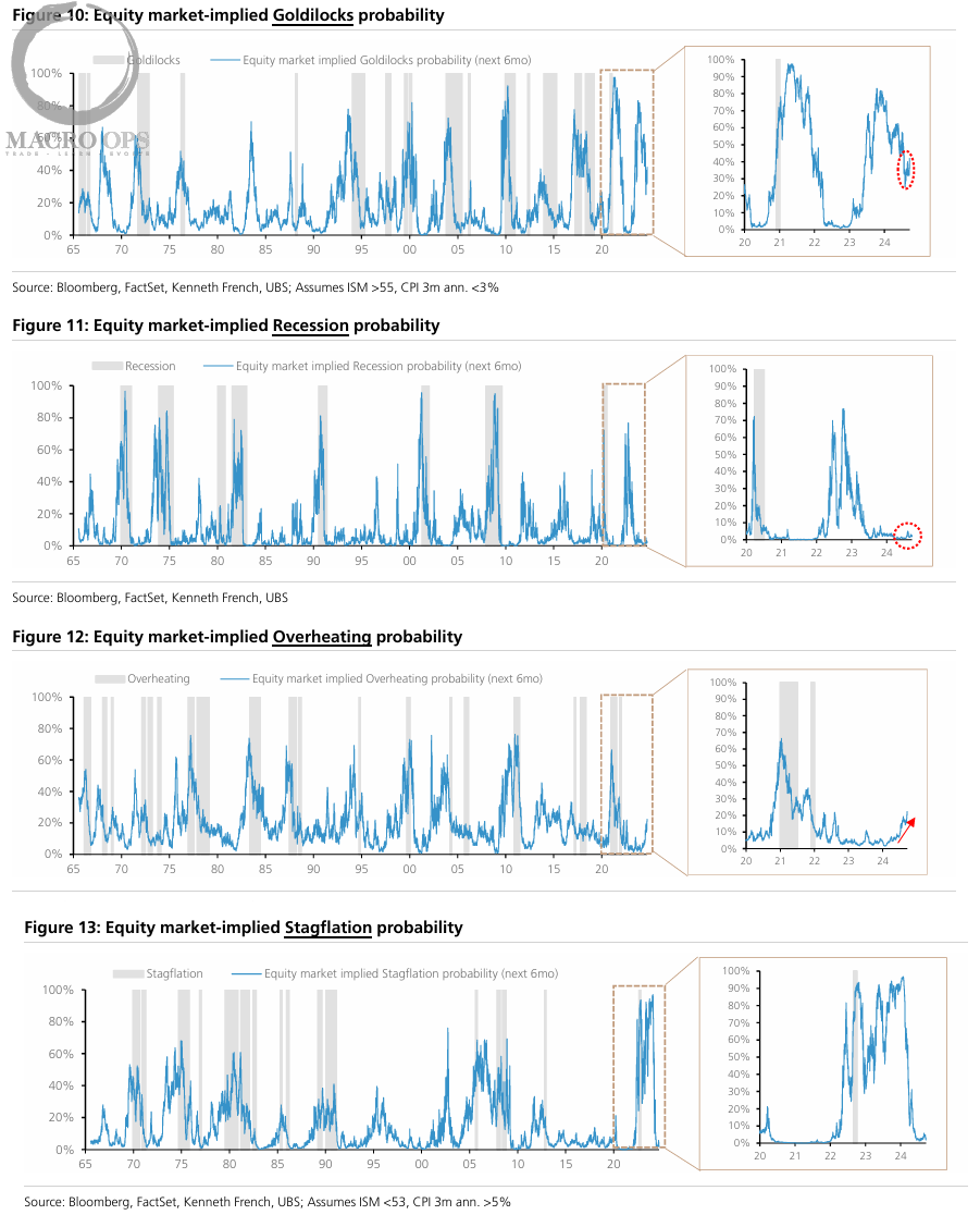
4. Here are some interesting charts from UBS showing the equity market implied probability of various economic scenarios. They show that the market strongly favors a Goldilocks outcome. But… the possibility of an “Overheating” scenario is increasing.
I’m interested in recreating these charts for our Collective dashboard. They use Kenneth French data, so I’m guessing it’s some type of relative factor performance-adjusted chart, though I could be wrong. If you know how to recreate these, message me at alex@macro-ops.com or DM me in our Slack if you’re a Collective member.
I’ll give a free quarterly subscription to the first one to reply with the correct answer.
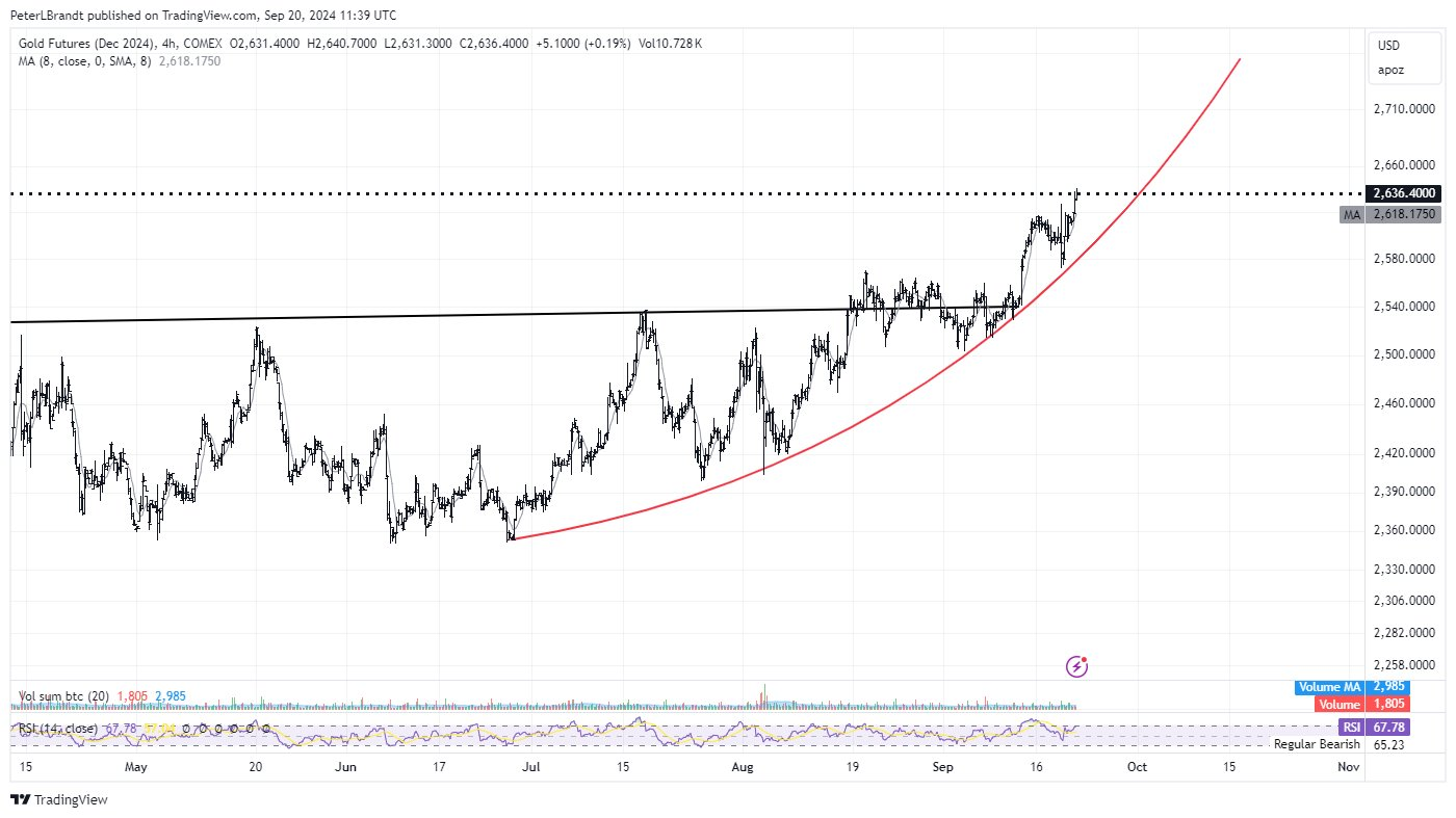
5. Gold going parabolic… via @PeterLBrandt
“As of current price action, it is possible to define Gold as having entered a parabolic advance (in red). It is an easy mistake to take profits prematurely in parabolic moves. Previous bull cycles of Bitcoin are cases in point.”
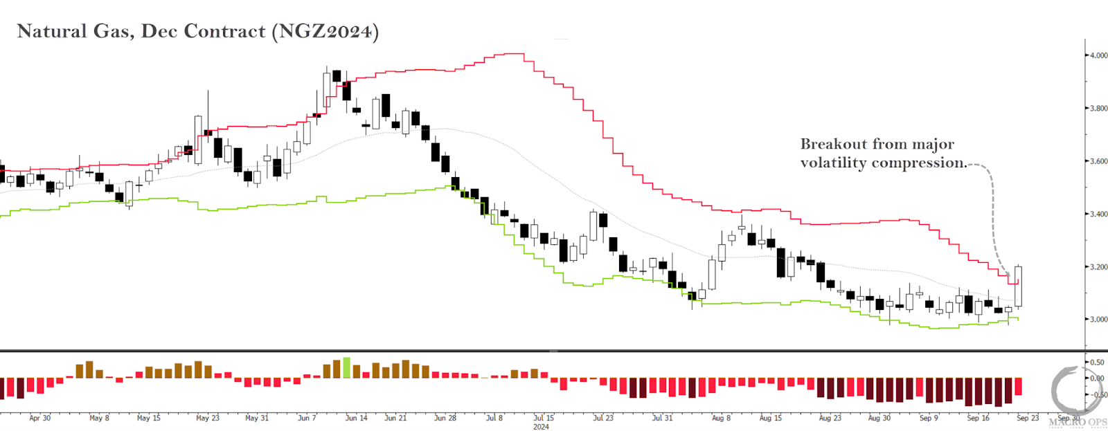
6. On Friday, December Natty broke out from a tight compression regime. As we know, compression regimes tend to lead to expansion regimes (i.e., trends). We currently have buy stops set to get long.
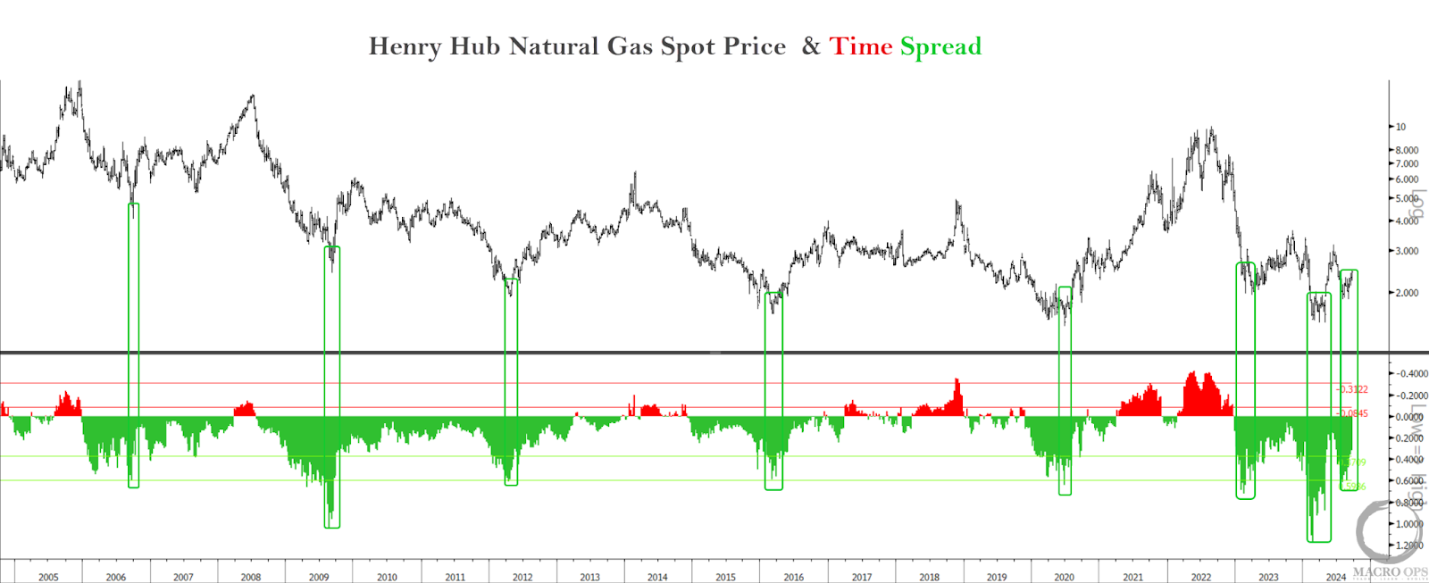
7. Natty’s futures curve is at levels that typically mark significant lows. Green bars show past instances. We also have neutral positioning, favorable seasonal tailwinds, and a low relative valuation.
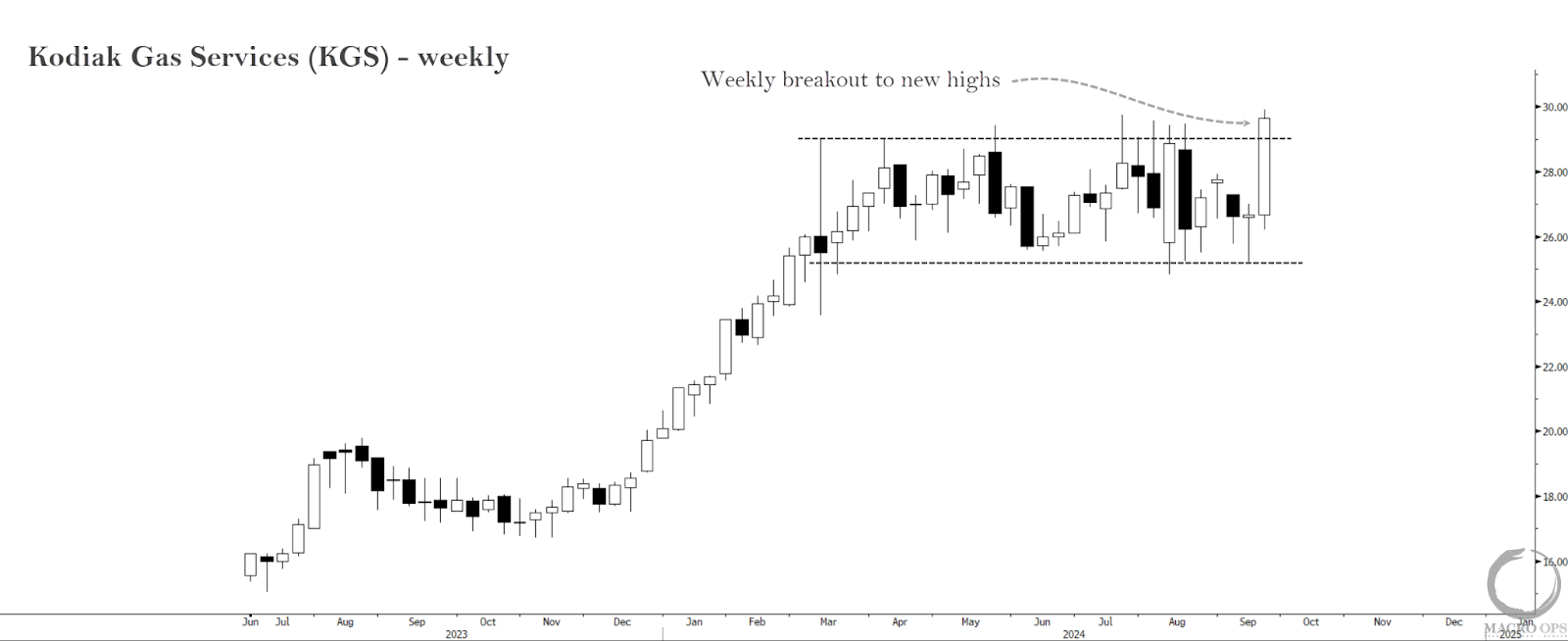
8. Besides playing the futures, we’ll be rolling over some DOTMs we own on a producer. We’re also revisiting this name, Kodiak Gas Services (KGS). I mentioned KGS in these pages sometime late last year. They’ve had a good run since then, and the weekly chart recently broke out from a multi-month sideways rectangle. You can find a VIC write-up on the company here. Brandon and I will be sharing our thoughts on the name with Collective members soon.
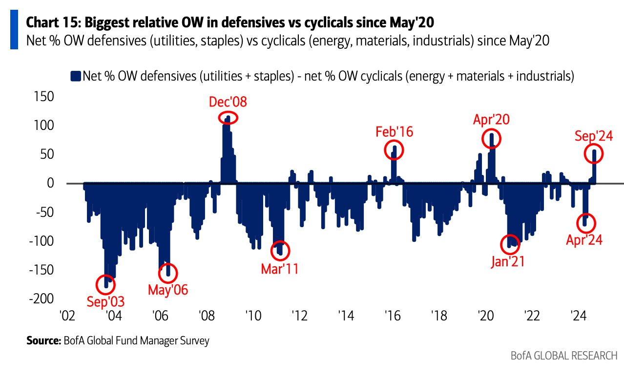
9. This is the positioning you typically see near major lows, not tops. Via the most recent BofA FMS:
- Relative net overweight in defensives (utilities & staples) vs cyclicals (energy, materials & industrials) is now the highest since May’20.
- Note FMS investors are now the most OW utilities since Dec’08, at net 8% OW.
- Investors are the most UW energy since Dec’20 (net 17% UW), and most UW materials since Jun’20 (net 17% UW).
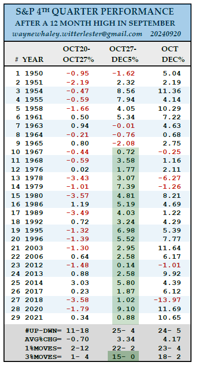
10. Some interesting market stats from Wayne Whaley:
“A NEW 12 MONTH HIGH IN SEPTEMBER
On Thursday, September 19, the S&P closed at a new 12 Month High as well as an All Time High.
Since 1950, there have been 29 years in which a 12 Month High was set in September.
In those 29 prior cases, the Fourth Qtr was 24-5 for an average, Quarterly gain of 4.17%.
The weakest spot in the Fourth Qtr, on average, was October 20-27 with that week experiencing 12 one percent losses and only two +1% winners.
The Sweet Spot was Oct27-Dec5th, which was 25-4 with the 3% moves 15-0. The last twenty, dating back to 1967 have been positive.”
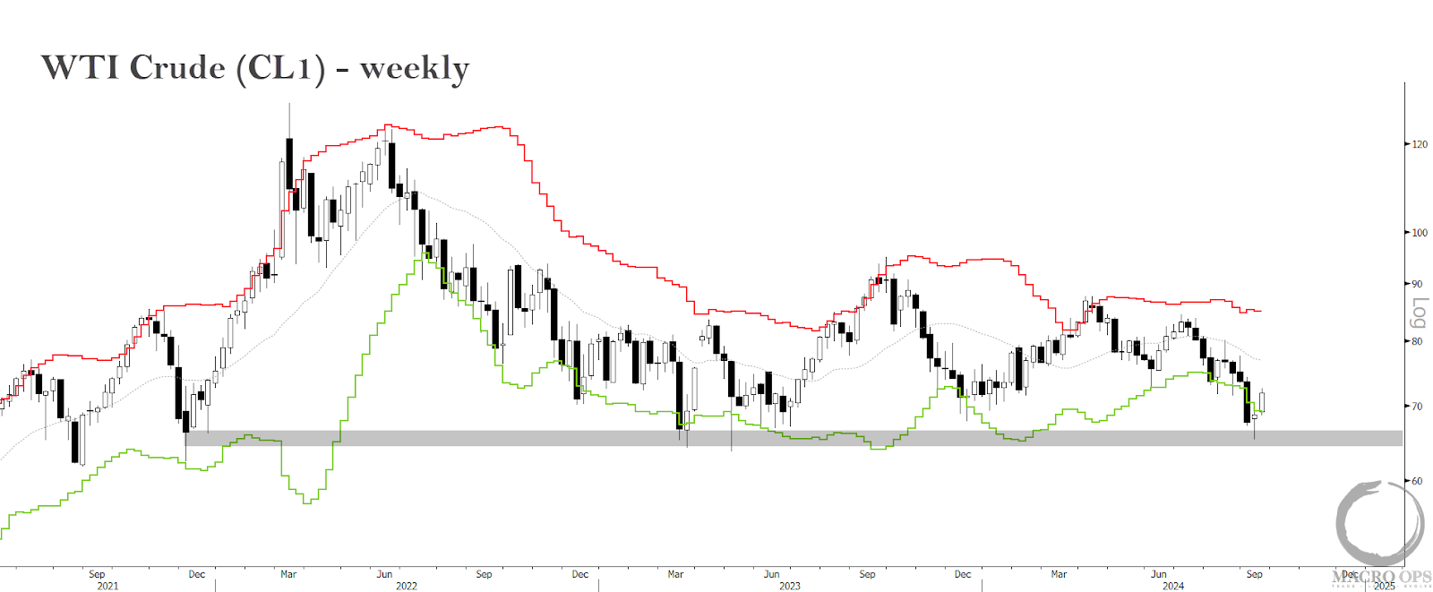
11. Two weeks ago I pointed out the likely bottom in crude (link here). The key support level has since held, and the tape is confirming that a bottom is in. This is with the backdrop of extreme consensus bearish positioning/sentiment, deep long-term oversold technicals, and a 0th percentile relative valuation score.
We’re buying.
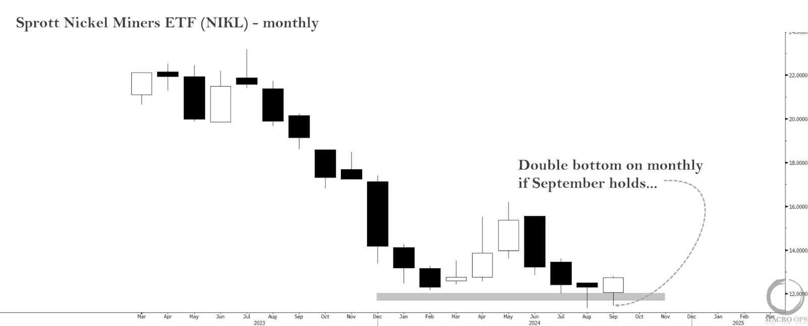
12. A surge in production from Indonesia and China has plagued Nickel over the past few years. This increase in supply has been exacerbated by stunted demand, primarily due to China’s struggling RE market.
But there are a number of positive catalysts on the horizon (1) major producers have been shuttering mines and suspending nickel operations and (2) automakers are opting for high-nickel batteries in newer models, with the battery sector expected to account for over 40% of nickel demand by 2033.
The Sprott Nickel Miners ETF (NIKL) is putting in a double bottom on the monthly chart, holding its key $12 support level. It also has a 21% dividend yield. Not too shabby…
Thanks for reading.