“Modern man is conditioned to expect instant gratification but any success or triumph realized quickly, with only marginal effort, is necessarily shallow. Meaningful achievement takes time, hard work, persistence, patience, proper intent, and constant self-awareness. The path to such success is punctuated by failure, consolidation, and renewed effort. It is wet with the tears of emotional breakdown. Personal reconstruction is art. Discovering one’s self, one’s talent and ambition, and learning how to express it is a creative process so may not be rushed.” ~ Mark Twight
In this analysis, we unpack key financial indicators and investment strategies crucial for identifying generational buying opportunities. We explore the nuances of the Bull & Bear Indicator, as well as the long-standing Coppock Curve Strategy, an invaluable tool for highlighting major market bottoms. Through real-world examples such as the U.S. Dollar and Nintendo, we demonstrate the practical application of these indicators. Whether you’re a seasoned investor or a beginner, this deep dive offers rich insights into the complex world of investing.
Unlocking Market Trends: Bull & Bear and Coppock Curve Indicators Explained
–
- Last week’s Flow Show summary via BofA with highlights by me.
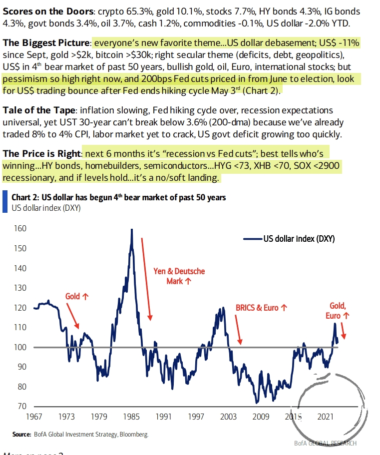
- We’re in this very strange time where the leads and lags between the typical liquidity cycle and its economic / market impacts is stretched and distorted due to the continued rundown of stimulus-driven excess cash savings, which is keeping the game going longer than would have otherwise been the case (charts via BofA).
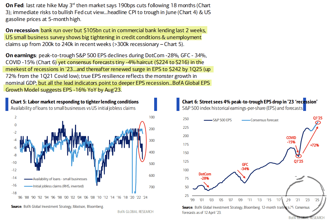
- But we gotta play the tape and conditions in front of us and that continues to be supportive of higher prices over the near term. BofA’s Bull & Bear Indicator is just a few points from triggering a buy signal.
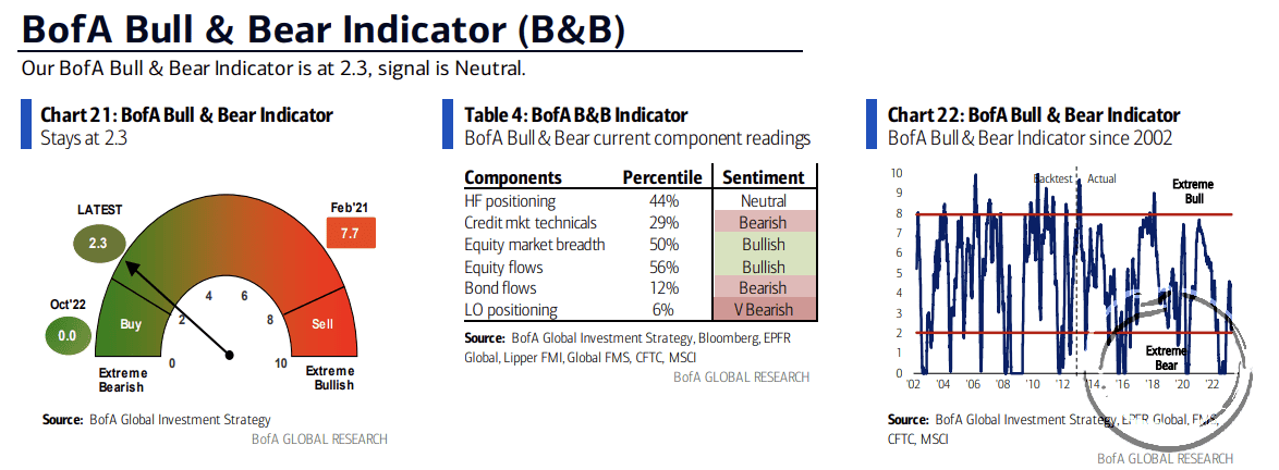
- And the overly bearish sentiment/positioning/flows is pretty telling considering the market has held its lows that were put in six months ago.
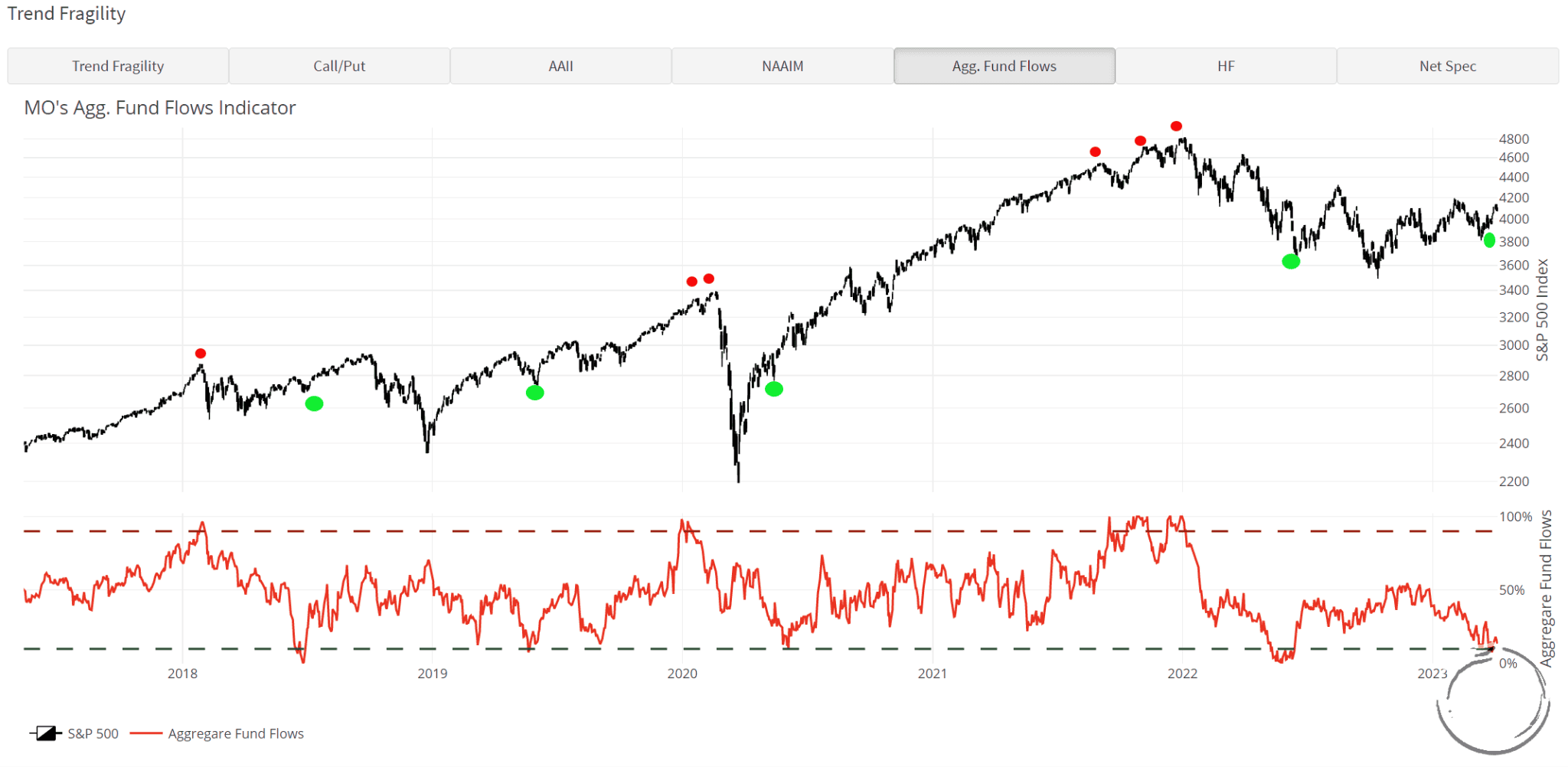
Similar to BofA’s indicator our Trend Fragility indicator (a composite of sentiment, positioning, and flows) hit a low of 11% a few weeks ago, which is just 1% away from the 10% needed to trigger a classic buy signal.
Below is one of the TF indicator components which shows aggregate index fund flows as a percentage of its 3yr average. This indicator triggered a buy signal last week. Green dots mark past signals and red dots mark past sell signals.
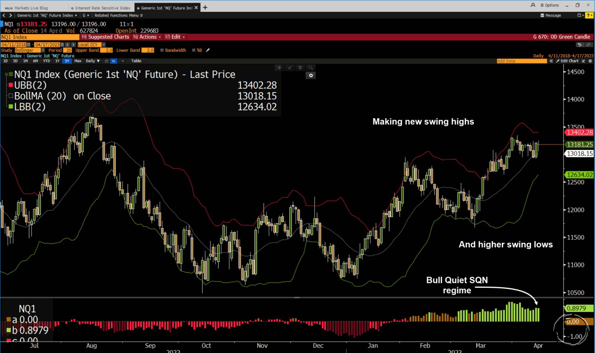
- We added some risk to our book last week and got long the Qs (the chart below is a daily). They’re in a classic Bull Quiet regime where the best-looking sell setups keep failing as the tape makes higher swing lows and higher swing highs. In BullQ regimes you want to buy dips and buy the rips.
- Simon White of BBG wrote a piece looking at the recent long-term buy signal given by the Coppock’s Curve, something a few Collective members have also pointed out recently (h/t Phil D.).
What is the Coppock Curve Strategy
The Coppock’s Curve is a long-term momentum-based signal developed by Edwin “Sedge” Coppock back in the 1960s. It’s essentially a monthly RoC indicator that is smoothed with moving averages. It has a pretty good record of marking major bottoms a few months after the fact. You can read more about it here.
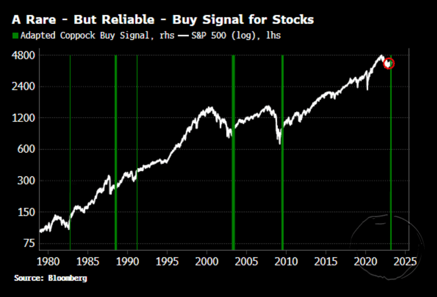
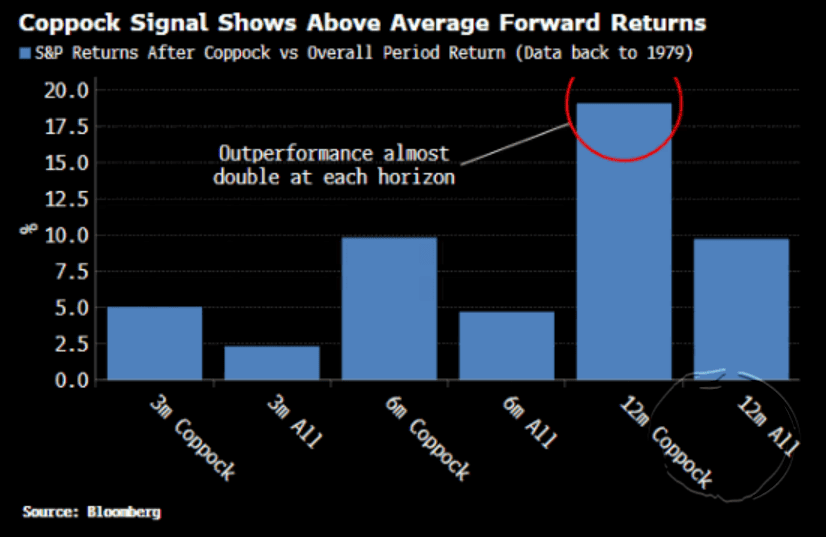
- White writes that “based on adapted parameters, it triggers only rarely, but the times when it has done —e.g. October 1982, August 1988, April 2003, August 2009 — are a catalog of generationally good buying opportunities. It outperforms the average S&P return over 3-month, 6-month, and 12-month horizons, with the greatest absolute outperformance over 12 months (19.1% versus 9.7%).”
Note to bears (and I include myself in this)… these are important signals and need to be heeded. There is no sure thing in markets but developments like this should at least make you check your priors and maybe reweight the risk allocation in your book somewhat.
- So there’s been an increasing amount of talk about the coming death of the US dollar. This is one of those lame and completely asinine narratives that seems to seep out from prepper bomb shelters every time the dollar has fallen a bit over the previous few months.
I love when this kind of talk becomes popularized because it means we’re nearing a durable bottom in the USD, so now we know it’s time to start paying attention for a fade trade.
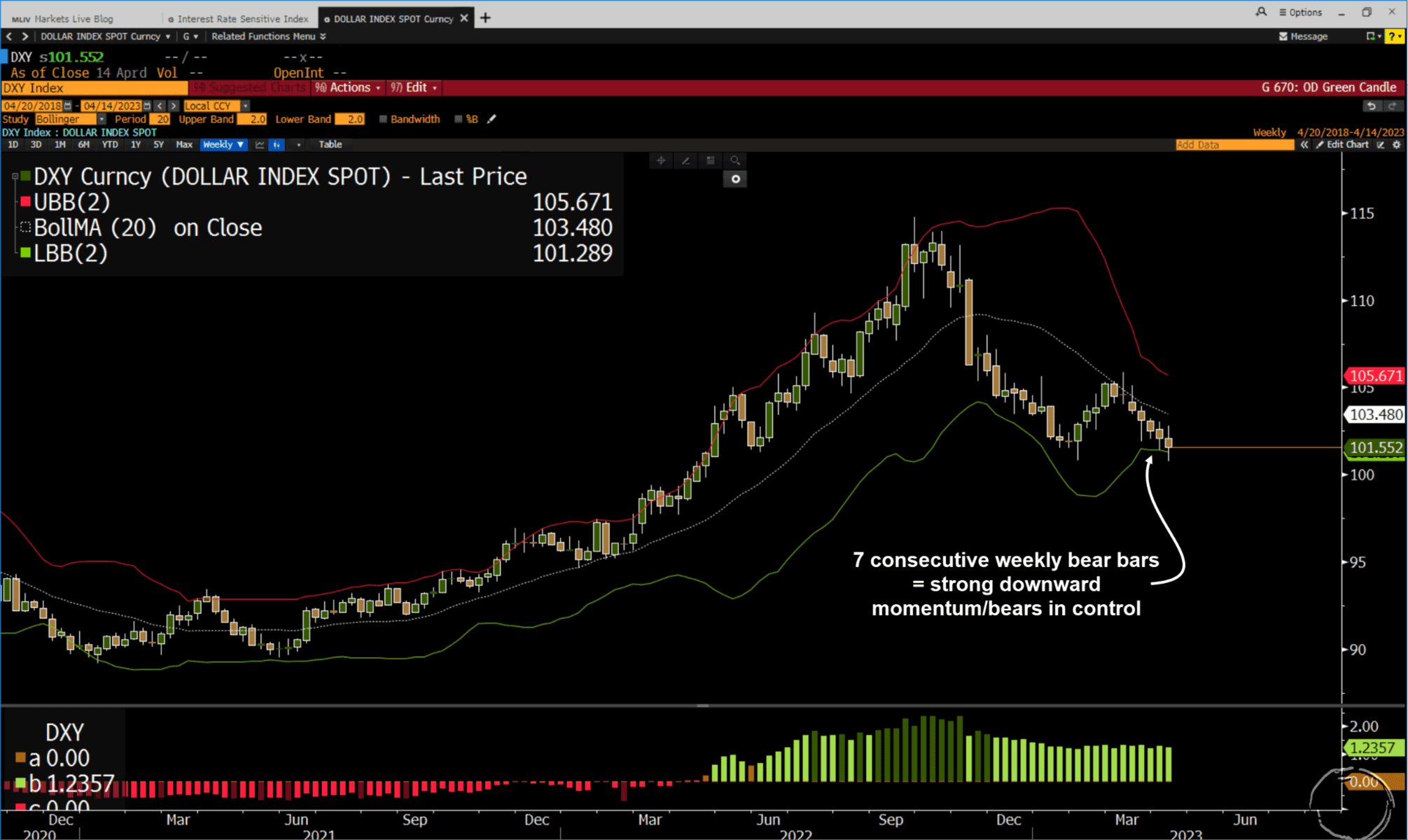
Here’s a weekly chart of DXY. It’s at its lower weekly band and may be putting in a double bottom. But… it recently printed 7 weekly bars. That’s quite a bit of a momentum and we don’t like to step in front of trains at MO. So we just need to let the tape develop some more. I’m guessing the DXY will bounce soon, but not by much before moving in another short leg down, putting in a 3-wave bottoming pattern.
That’s just my guess. We’ll see what the chart brings us.
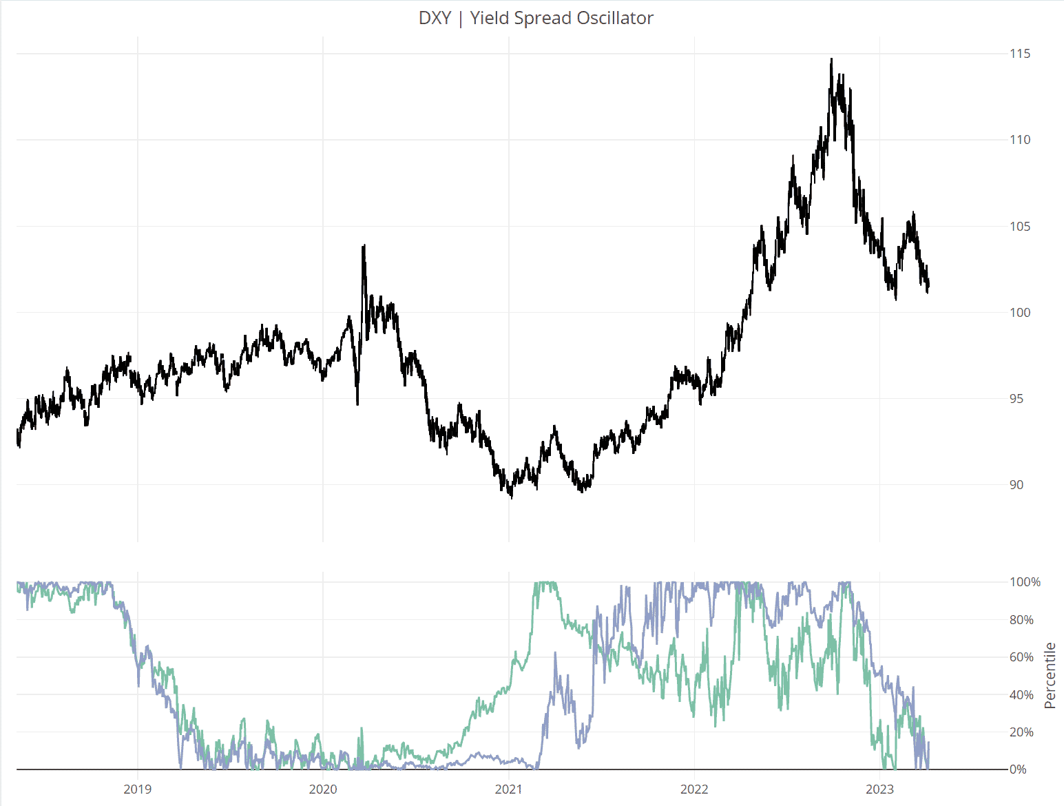
- Also, we’ll want to see DXY yield spread momentum (as pictured below in our oscillator) accelerate to the upside before we turn constructive. I think this starts happening soon though (green line is 10yr yield diffs and purple is 2yr yield diffs).
- We’ve been patiently watching Nintendo for a while now (a bit over a year maybe?). We like the company, its products, and the direction management is taking to monetize its extremely valuable and incredibly under-monetized IP through theme parks (which are a big hit so far) and now movies (an even bigger hit).
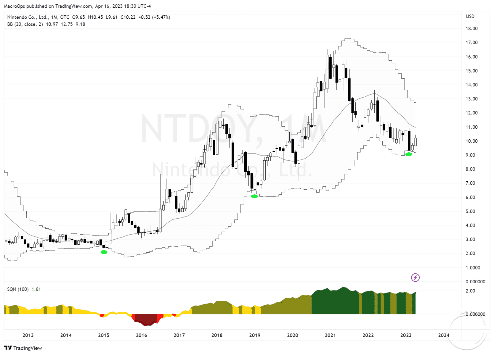
Here’s NTDOY on a monthly chart. It’s at its lower monthly Bollinger Band, which in the past has been a good buying opp. It’s still in an intermediate downtrend but I’m starting to pay close attention.
- Proof of concept: NTDOY’s latest Super Mario Brothers movie is now the highest-grossing video game adaptation ever.

And I’m sure the new movie is good and all but I have no plans to see it. The reason is that you just can’t improve on perfection and the original 1993 Super Mario Bros movie was a masterpiece.

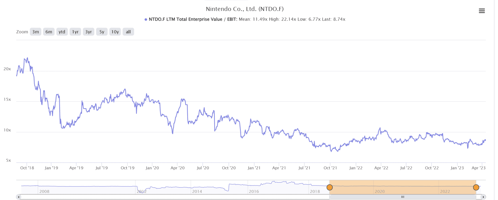
- The stock is historically cheap, trading at just 8x TTM EV/EBIT multiples.
Thanks for reading.
Stay frosty and keep your head on a swivel.


