“We went short Polaroid when it was selling at sixty times earnings, which we thought was absurd; it then went to seventy times earnings. The market seemed to lose track of reality, and we found ourselves asking, ‘What is the difference between forty times earnings and eighty times earnings?’ By putting a different number on the secular growth rate estimate, you could justify almost any multiple. That is how people were thinking in those days ” ~ Michael Steinhardt
***Note: Just a heads up, since a number of you have been asking about it. Spring enrollment into our Collective kicks off today and will be running into the end of the week.
The Collective is our full-kit soup-to-nuts service that provides research, theory, and a killer community that consists of dedicated traders, investors, and fund managers from around the world. We’ve been told that there’s nothing else like it on the web. If you’d like to tackle markets with our group (whom, I should note, has been having a great year in markets), then just click the button below and sign up. And, as always, don’t hesitate to shoot me any Qs!***
Good morning!
In this week’s Dirty Dozen [CHART PACK] we look at buybacks, the trend towards more frequent market dislocations, what a real equity bubble looks like, crypto’s voracious energy appetite, deglobalization, and more…
Let’s dive in.
***click charts to enlarge***
- There’s a persistent bid under this market in the form of buybacks which are running at a record pace since the start of this year. According to EPFR, announced buybacks are averaging $6.9bn a day this earnings season, which is the highest level since 06’.
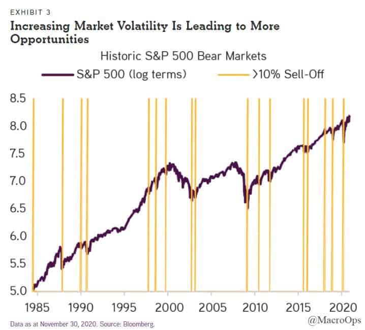
- This chart from KKR shows every 10% or greater correction in the SPX over the last 35+ years. I have two takeaways: (1) man, investors in the 90s were spoiled and (2) markets are becoming more prone to large dislocations, as we’ve seen over the last decade. This is bullish in a sense for the duration of the market cycle because these frequent corrections (we call them trend thorns at MO) keep investors from leveraging to the point that it causes real instability.
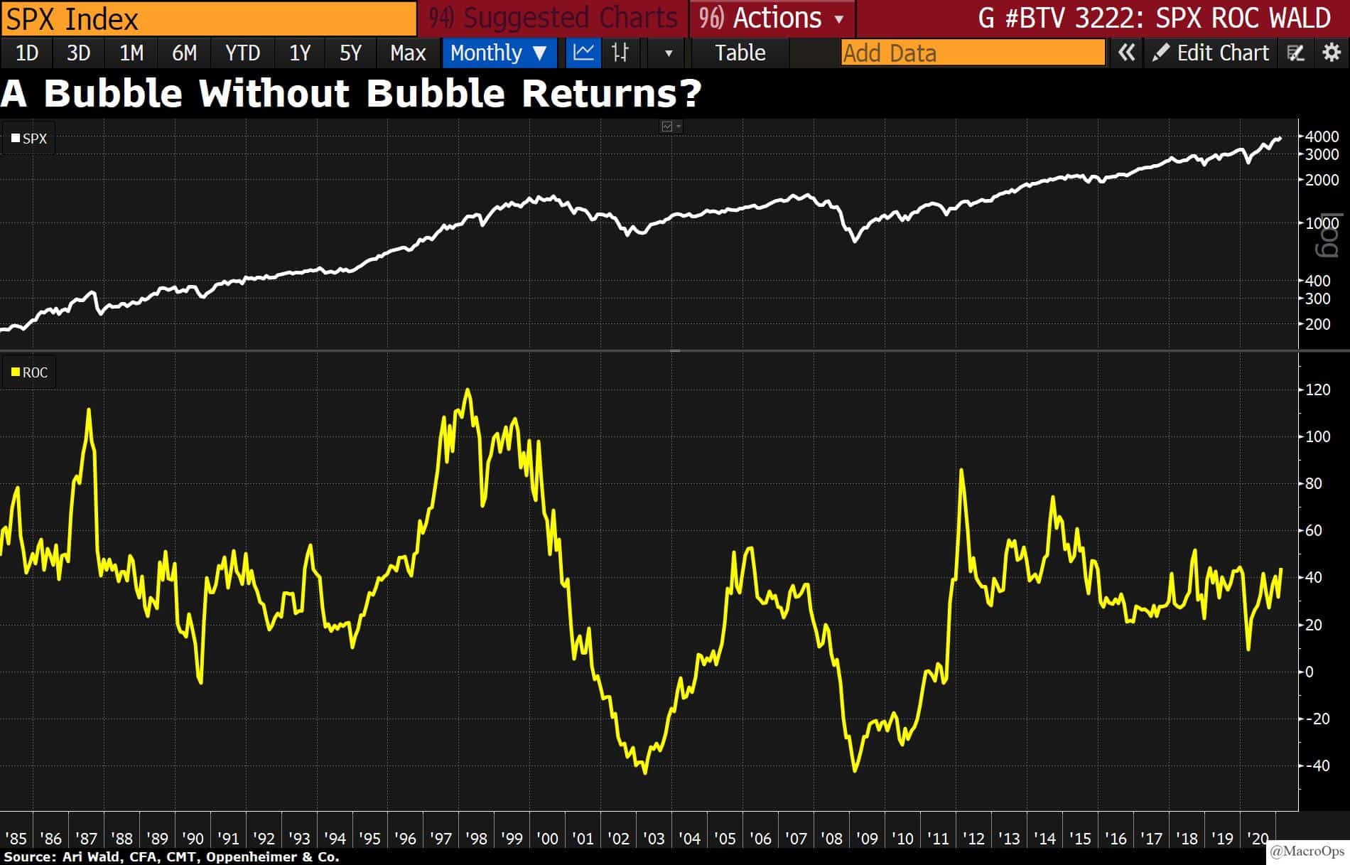
- The bubble callers are back after being in hibernation for the last few years. The chart below is a good illustration of what the returns of a real equity bubble look like. The yellow line shows the 3-year rate of change for the SPX. In the late 90s, it spent multiple years above 100%. It’s at 40% now (chart via Ari Wald).
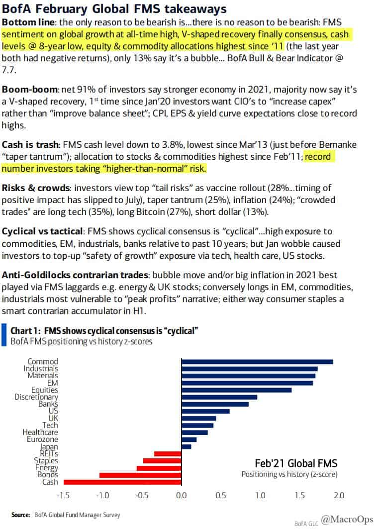
- The latest BofA Fund Manager Survey is out. Below are the highlights.
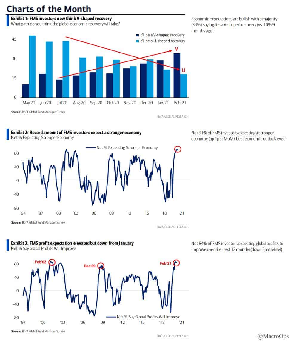
- And here are the most notable charts from the report.
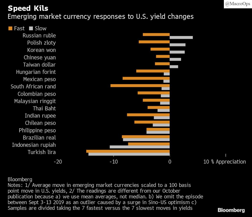
- The yield curve is steepening at an accelerating pace. BBG notes that “A speed limit of ~25 basis points per month for U.S. 10-year yields represents an important cut-off for emerging market currencies. Below that pace, many low yielders are likely to appreciate, and any declines in higher yielders should be relatively contained.”
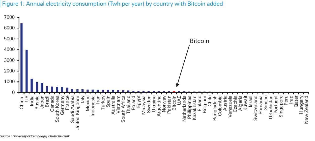
- @riholtz tweeted the below chart along with the following “Bitcoin’s annual electricity consumption puts it at the edge of being a top 30 country. Annually, it consumes as much electricity as the entire population of Pakistan — 217 million people. (via Deutsche Bank)”.
Not sure how this “ungreen” credential is going to sit with our Gamemasters. As @jackdanger points out in this thread, “If Bitcoin’s price ever reaches $1m it will output more carbon than the entire US and consume 2x the entire electrical production of the US.” This is just one reason amongst many on why bitcoin will never be a credible currency or store of value but is instead just a vehicle for speculation…
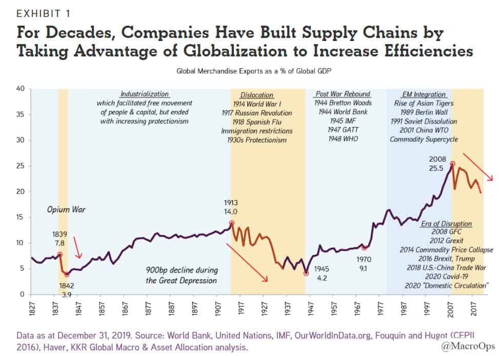
- Here’s a great chart from a recent KKR piece on the reorganization of global supply chains (link here). Deglobalization is one of key secular trends we’re tracking at MO.
- Fiscal stimulus is the dominant feature of this market and economy. It’s a critical paradigm shift, and will likely remain a key policy tool in the decade ahead.
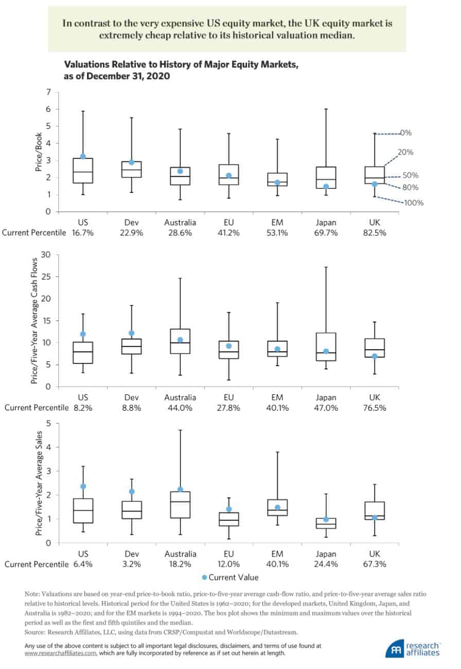
- Research Affiliates believes the UK will be a top performer in the coming years. Brandon and I are digging into some UK names this week.
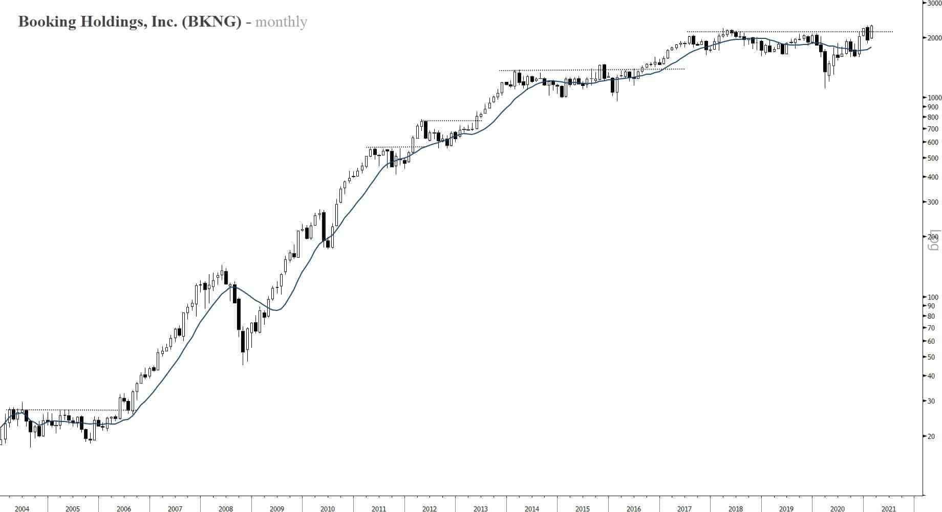
- COVID cases are dropping and vaccination rates are accelerating… The economy is going to be reopening and running hot by mid-year. BKNG is one of many reopening plays with a great long-term chart.
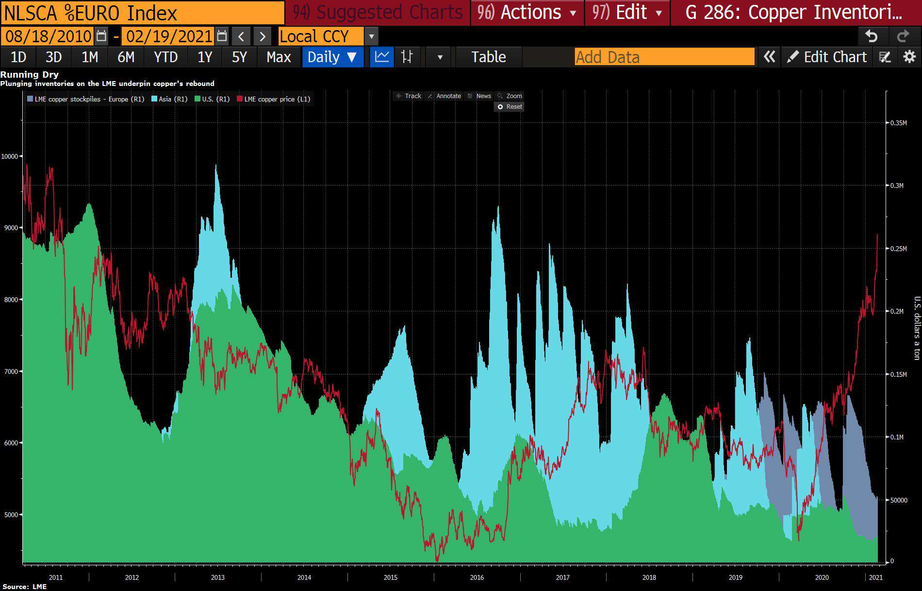
- Long copper has been a beast of a trade these past few months. There’s a number of tailwinds behind this move. One of them being the confluence of renewable energy developments creating high copper demand and record low inventory levels to start the year.
Our position in BHP sits at the nexus of this and many other secular and cyclical trends.
***Note: Just a heads up, since a number of you have been asking about it. Spring enrollment into our Collective kicks off today and will be running into the end of the week.
The Collective is our full-kit soup-to-nuts service that provides research, theory, and a killer community that consists of dedicated traders, investors, and fund managers from around the world. We’ve been told that there’s nothing else like it on the web. If you’d like to tackle markets with our group (whom, I should note, has been having a great year in markets), then just click the button below and sign up. And, as always, don’t hesitate to shoot me any Qs!***
Stay safe out there and keep your head on a swivel.


